Savings.Club · Fintech (US)
The whole member journey, rebuilt to sell, sign and keep members
Savings.Club lets people in the US finance cars and homes without interest, through a cooperative savings club. The model is new to most people, and the journey was losing them at every step: a site that explained but did not sell, a sign up nobody could measure, and reminders that never arrived. I own every step a member goes through: the website where they discover the club, the flow where they sign, the app they join, and the messages that follow them.
- WhatsApp delivery, in two weeks
- 1.7% → 88.9%
- contract conversion from my acquisition redesign, 2021 to 2023
- +70%
01 · Discover · Website
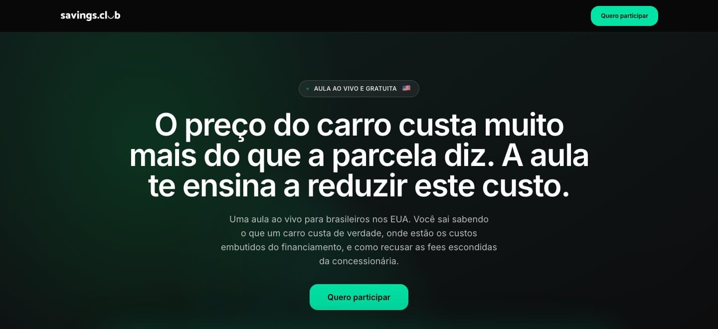
Turning a brochure into a site that sells
The old site ran on WordPress and read like a brochure. It explained the club, but it was not built to sell. I wrote a report on what was broken: 932 views a month were landing on 404 pages, and the calculator, the page with the most intent, had no next step. People tried a number and left.
I gave the site two jobs, selling and educating. I cut the homepage from 14 sections to 9, ordered as belief, proof and close, rebuilt the navigation, and pointed every call to action to one place: the contract flow.
- monthly views on 404 pages, found in my report
- 932
- homepage sections
- 14 → 9
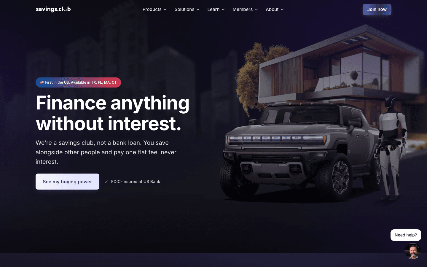
I said no to two ideas. A homepage built around an AI chat agent: the page had to sell on its own. And the calculator in the hero: one clear action beats a tool that asks visitors to do work. Features that were not ready, like booking a call, stayed hidden instead of shipping half done.
That report was also my case for leaving WordPress. I rebuilt the site in code with Next.js and AI-assisted development, through pull requests on GitHub reviewed by engineering. It is where my own journey into code started: my first commits were on this site. Before launch, every page passed a crawl with no broken links and an automated accessibility check.
02 · Sign · Contract flow
Cutting sign up to three steps, with the member's own offer
The old sign-up was tracked as a 9-step funnel, but only 4 steps were real, so nobody could tell where people dropped off.
I cut it to 3 steps and a welcome screen: getting started, review your offer, sign. Personal details come before the offer, so the number a member sees is their own, not a generic quote. Promo codes moved to the offer step, and the flow has no marketing header or footer, nothing to leave through.
I reskinned the production app without touching its logic, so engineering could ship it safely. On the welcome screen, phones get store buttons instead of a QR code: nobody can scan a code on the phone they are holding.
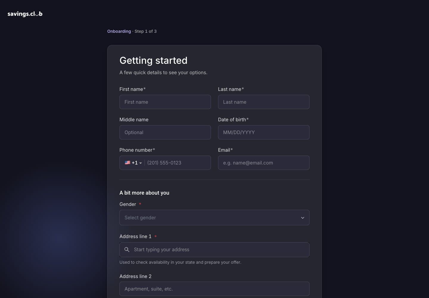
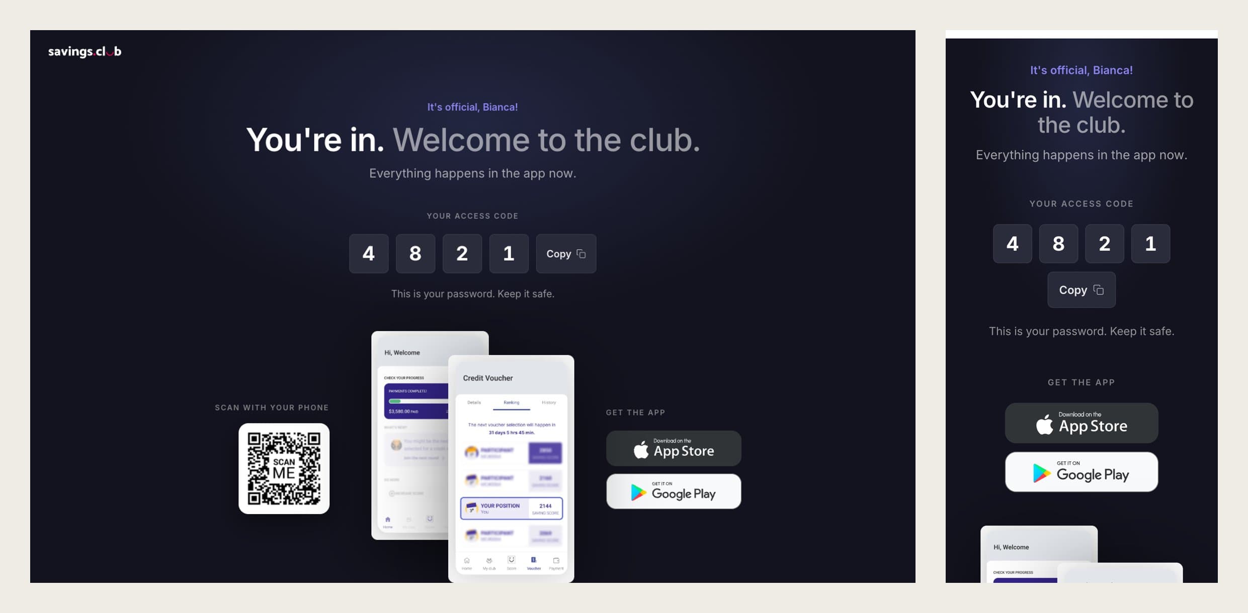
When the carrier rejected the SMS number because consent was not optional, I redesigned the opt-in as a separate, unchecked box with the disclosures carrier reviewers look for. The number was approved.
03 · Join · Member app
Designing the app around the moment members open it
After signing, members download the app. I redesigned it around the moment they open it: their score, their club and their voucher are always there, so the home screen is built for that state instead of an empty one.
One design library serves the web and the app. Cards that only make sense on a phone live in the app file, so the two stay consistent without forcing web patterns onto mobile.
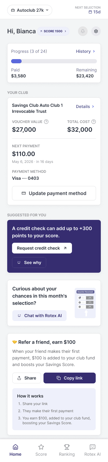
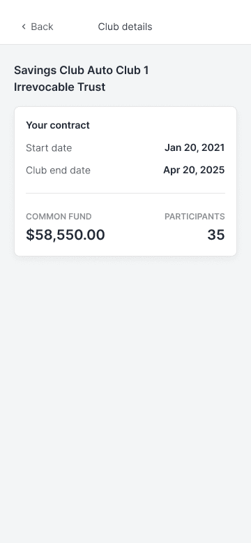
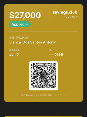
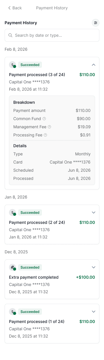
The home is a mix of states, not a pile of screens. A member's Score can be rising, steady or falling, their plan can be paying or complete, and each month they are either selected or not. I designed each one as a component with states, and drew a new screen only when the situation really changes.
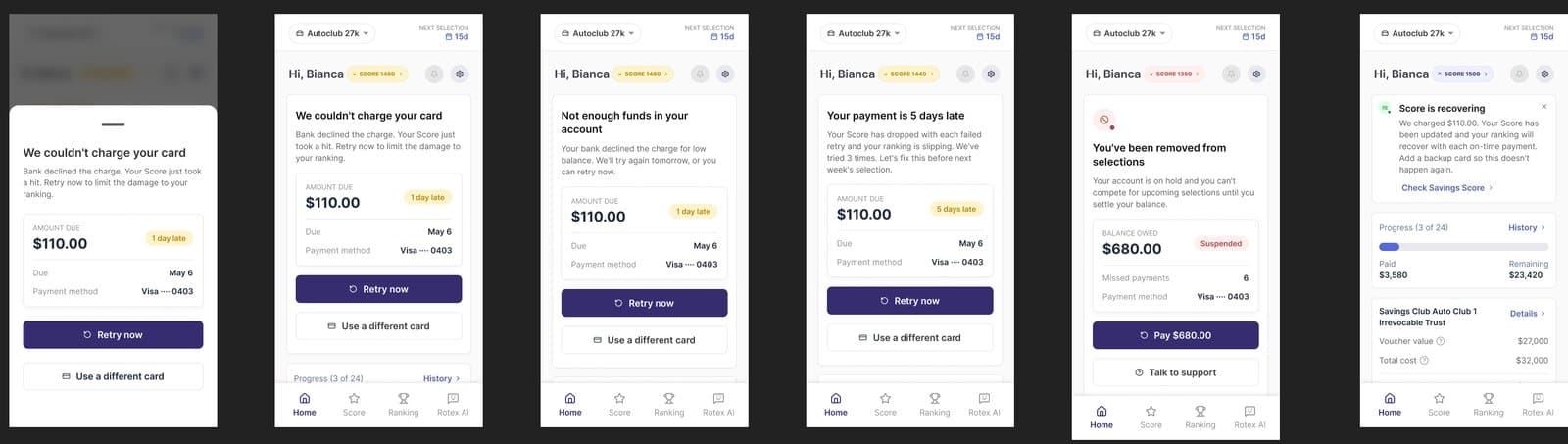
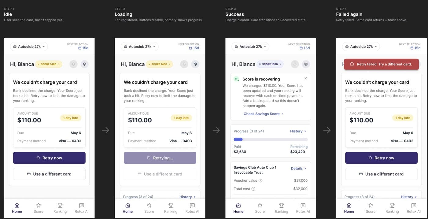
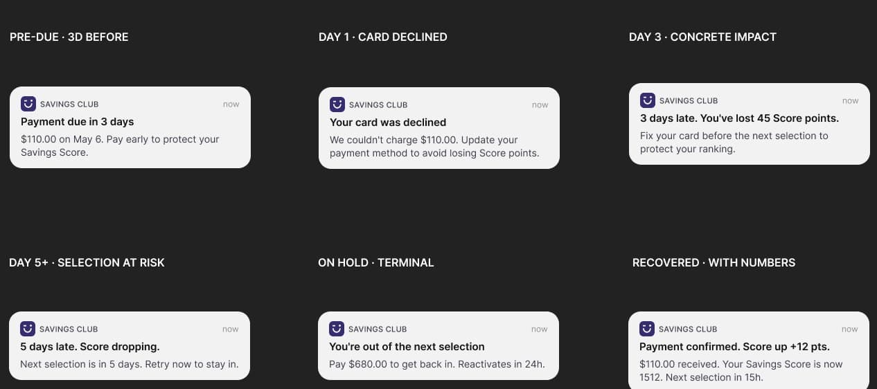
A failed payment is the hardest moment in the app, so I designed it as the home with a falling Score, not an error page. Each card says what happened, what it costs and how to fix it, with one main action. Color follows severity: amber while it is recoverable, red only when the member is removed from the selections, and green once they recover.
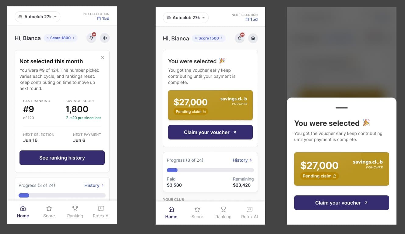
Being selected is the best moment. The celebration shows once, and then the home keeps the voucher on top until it is claimed, so closing a modal never erases a win. Members who were not selected see where they ranked and how to climb, not just a no.
04 · Follow up · CRM
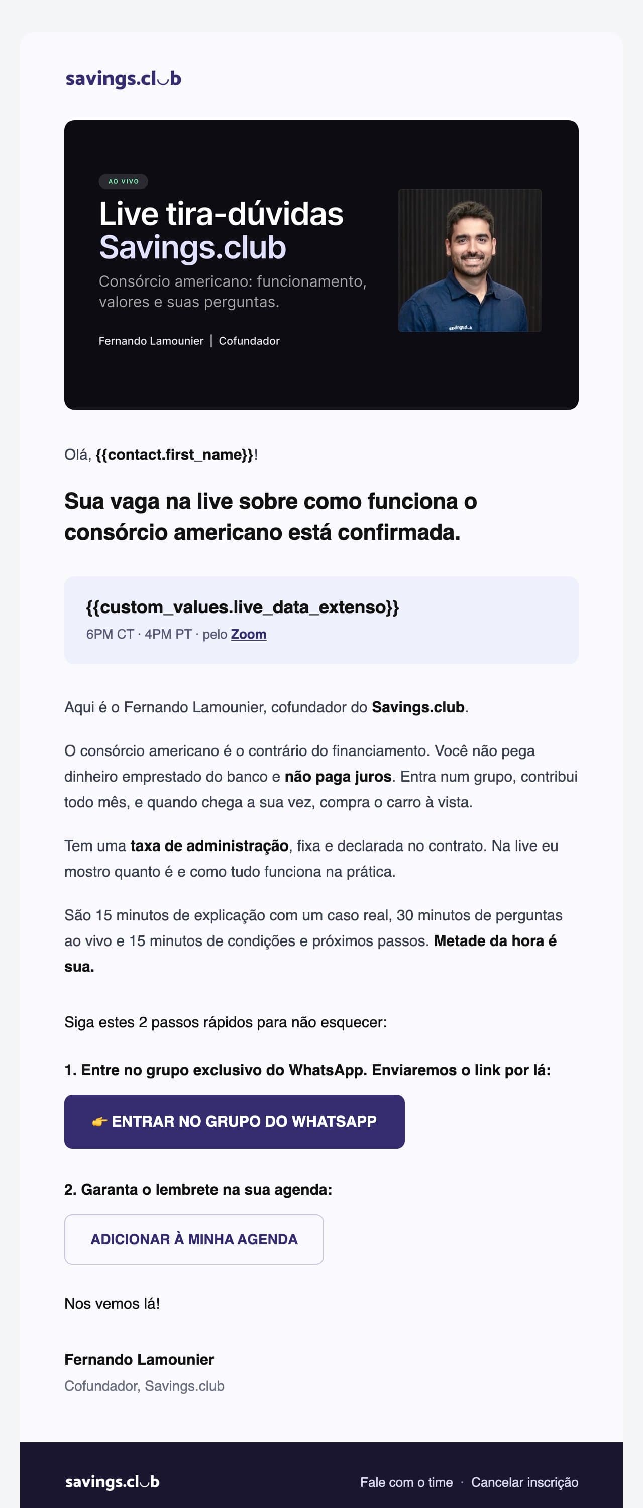
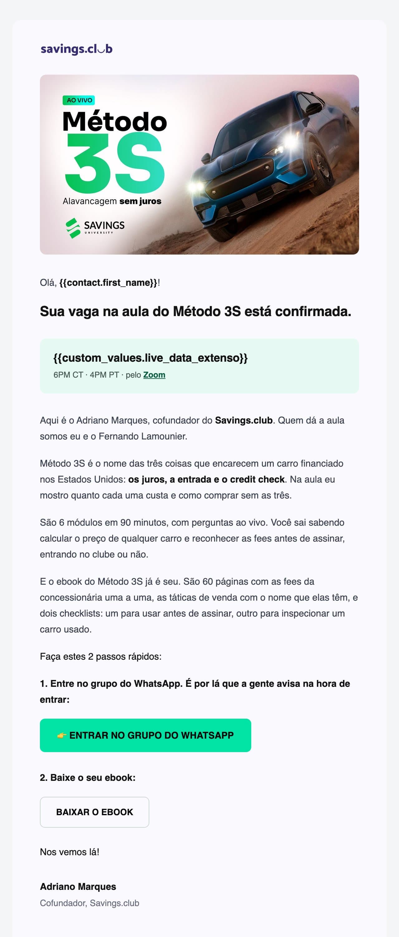
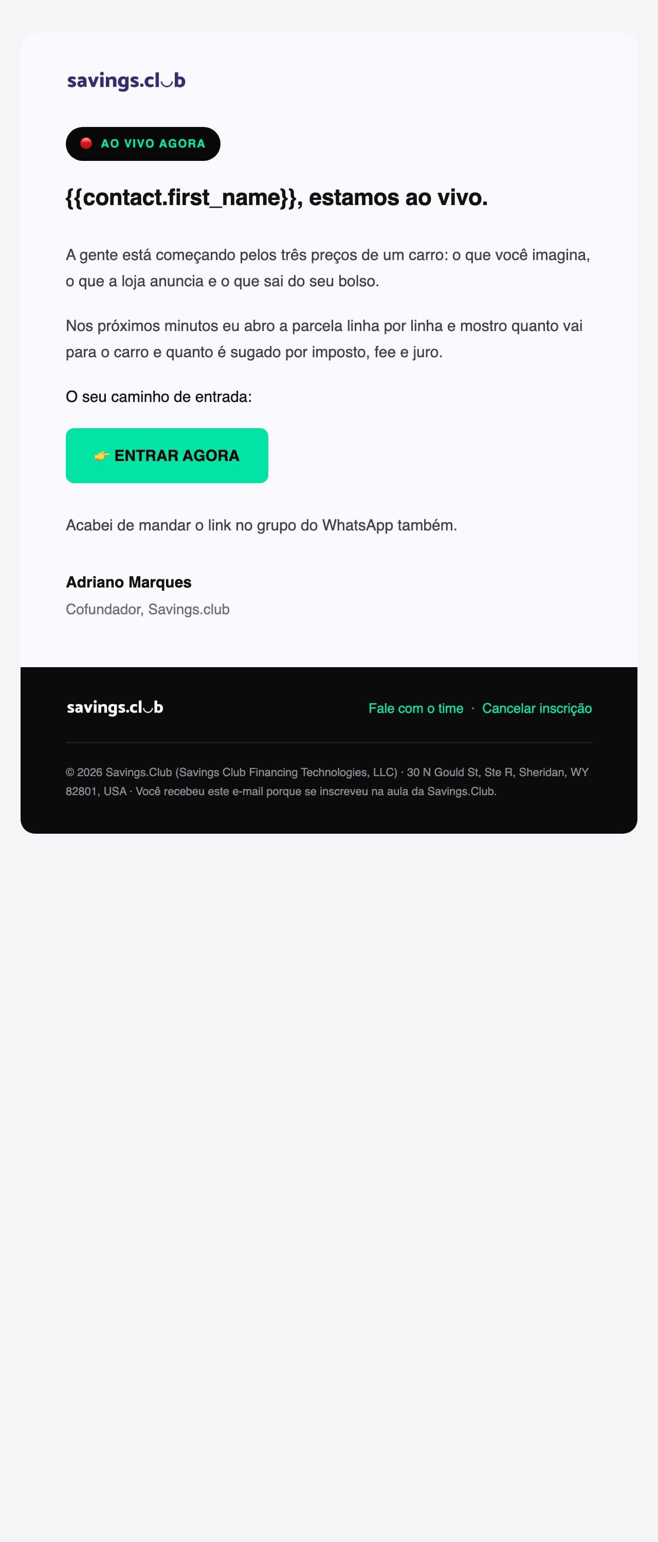
Making sure the messages actually arrive
People signed up for live classes and never got the WhatsApp reminders. Only 1.7% of messages were delivered. I traced it to the template category: Meta does not deliver Marketing templates to US numbers, and it fails silently. Almost every failure was a US number.
I rewrote the messages as Utility templates. Each one delivers the link the person asked for and names the event, nothing else. Invitations moved to a template of their own. Two weeks later, delivery was at 88.9%.
- WhatsApp delivery
- 1.7% → 88.9%
- email open rate
- 4.7% → 21.1%
I also rewrote the email sequence, and opens rose from 4.7% to 21.1%. In parallel I led the fix to sender authentication with engineering, which kept spam complaints at zero across 3,727 sends.
Before crediting the rewrite, I tested it. The same email, from the same sender, opened at 6.3% in its old version and 33.3% rewritten, on a small sample. I also found that Apple Mail marks almost every message as opened, so every rate here leaves Apple addresses out.
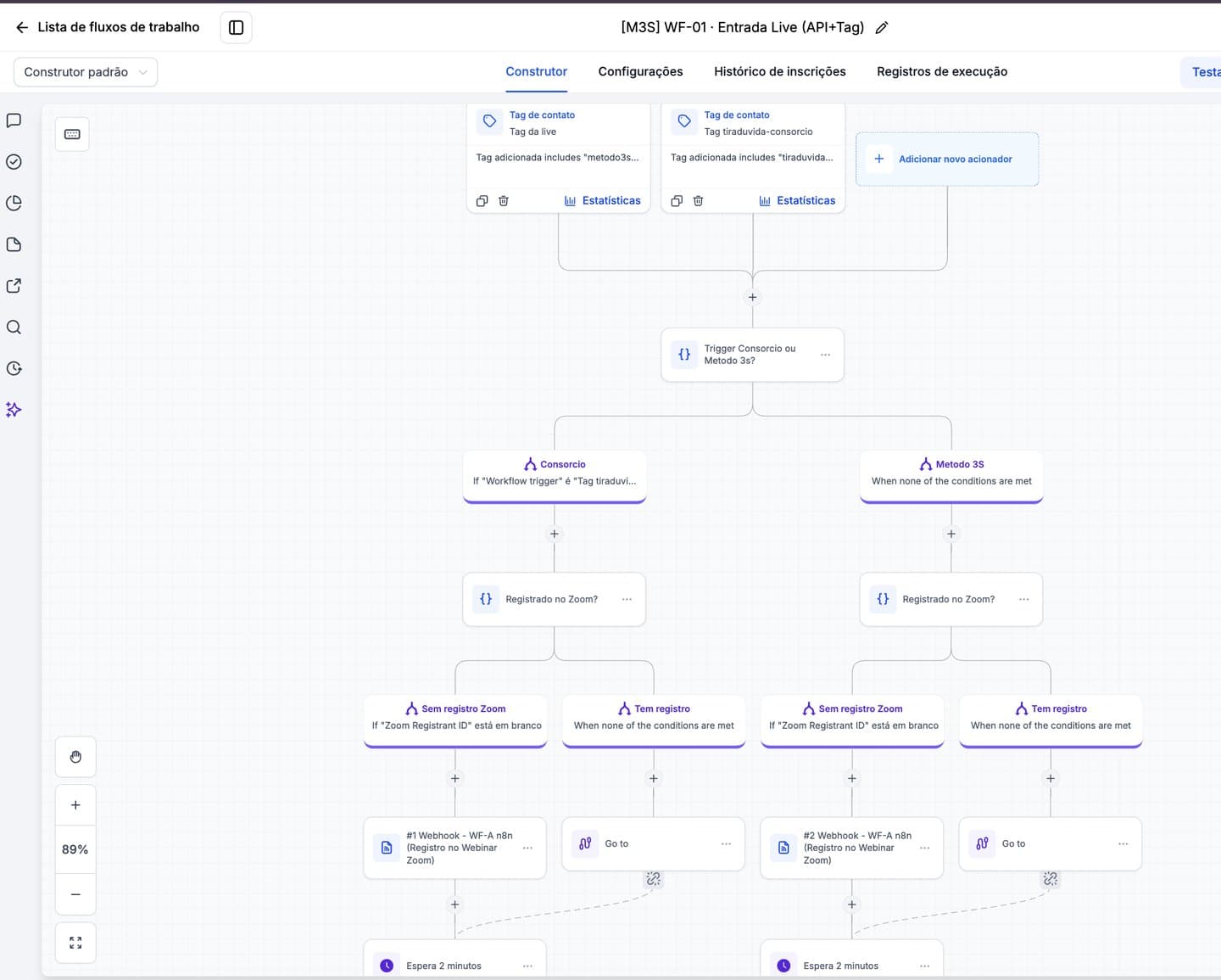
I built the workflows in HighLevel for email, WhatsApp and SMS.
2021 to 2023
Where it started
I joined Savings.Club in 2021 as a junior designer on a founding team with no product, no design and no system. The hardest part was never the UI. It was trust: asking people to finance a car through a model they had never heard of.
Research changed the positioning. The brand started as "Smart funding for smart people." Interviews showed people did not want to be called smart; they wanted a cheaper, interest-free way to buy what they needed. The message became "The cheapest way to finance anything."
- contract conversion, acquisition flow redesign
- +70%
- app downloads after the app redesign
- 2x
I also cut homepage bounce by 30% and grew the waitlist by 40%.


Learnings
- Trust in a financial product is built in the details: the copy, the color, and what a button promises.
- A screen can be perfect and still fail if the message never arrives. Owning the journey means owning delivery too.
- Before crediting a change, isolate the variable.
- Support and sales data surface the friction users do not put into words.