Helpjuice · AI knowledge base (US)
From dated knowledge base to AI-first platform
Helpjuice is knowledge base software used by teams at Amazon, Shipt and ZoomInfo. Most new accounts left before they got value, and the core flows kept support busy. I joined as a mid-level designer when the product had no design process, no standards and no design system. Over two years I grew into Lead and designed much of what turned it into an AI-first platform. Everything here shipped. The bigger ideas often came from the founder, and I made them buildable; the rest I shaped myself, merging features that belonged together and testing versions with customers. After launch I stayed close to them by email, calls and Intercom.
- retention after the onboarding redesign
- 7% → 37%
- support tickets after fixing core UX flows
- -87%
What I designed
- 01Onboarding and AI migrationNew accounts bring their old content in on their own, styled with their brand.Shipped
- 02Article requestsAnyone asks, the right expert answers in any format, AI writes the article.Shipped
- 03Swifty: AI chatbot and AI searchThe knowledge base inside any site or app, and analytics on what people ask.Shipped
- 04Helpjuice extensionThe knowledge base two slashes away, in any tab.Shipped
- 05WizardShot extensionA product designed from scratch, #2 Product of the Day on Product Hunt.Shipped
- 06WebsiteA site that sells an outcome, with every feature shown working.Shipped
- 07Design system and processBuilt from scratch, so a small team could ship all of the above.Foundation
- 08Also designedThemes co-created with customers, customization, the AI toolbar and launch pages.
Shipped · Onboarding and AI migration
Letting new accounts bring their own content in, without waiting for anyone
New customers were not sticking around. To see any value, they first had to bring in the knowledge base they already had, and that migration depended on our team doing it for them. The old onboarding filled the gap with sample content and a row of settings, so people configured a product that still had nothing of theirs in it.
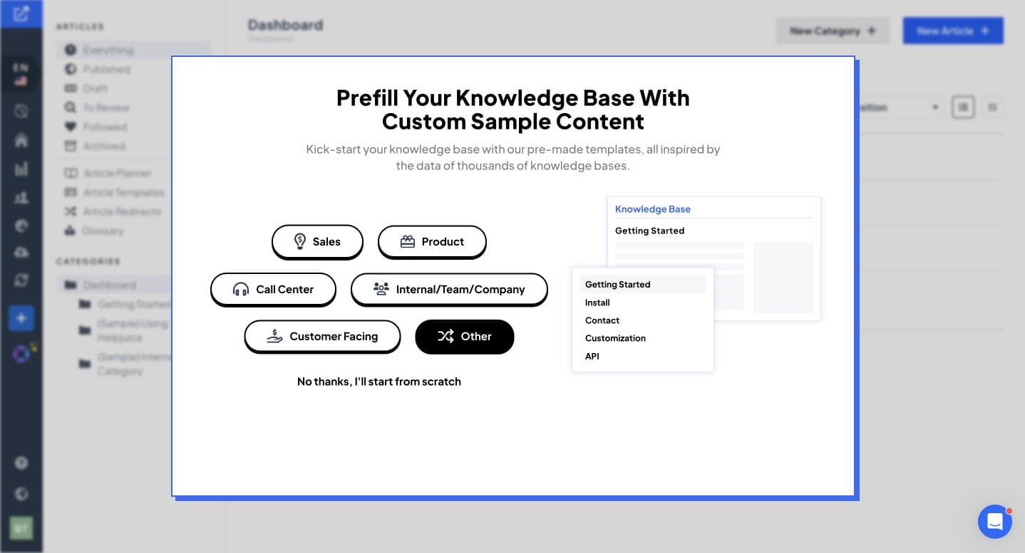 Before
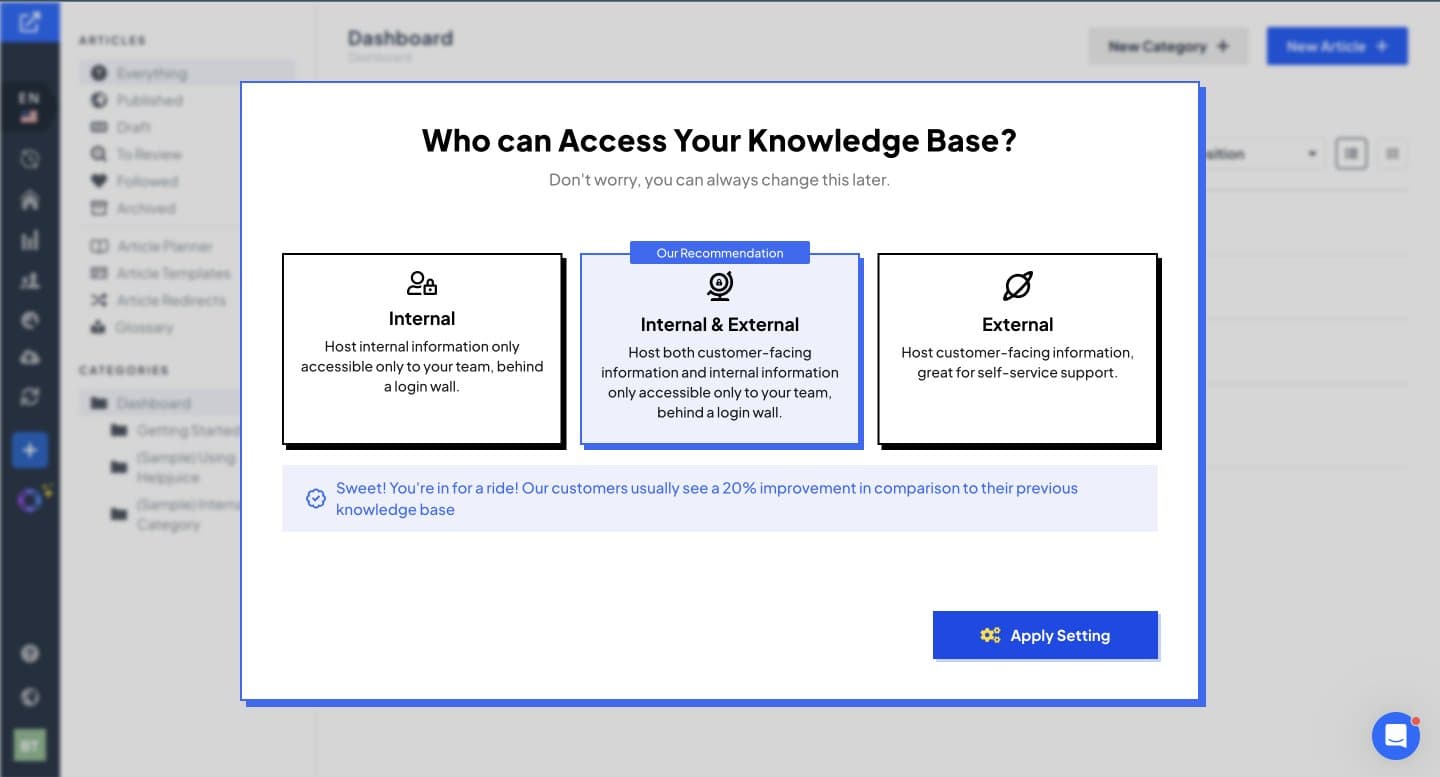 Before
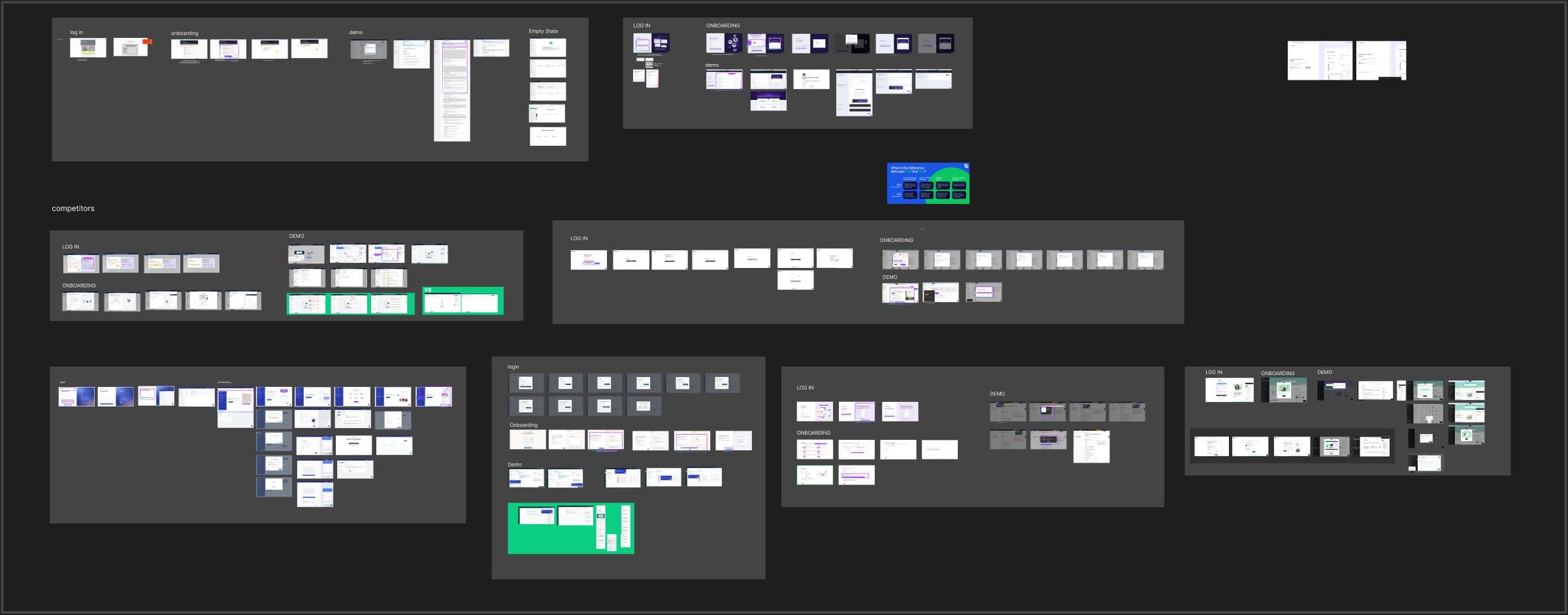
I mapped how competitors handle sign up, onboarding, demos and empty states, and highlighted what was worth keeping. Then I met with sales, support and engineering to learn where new accounts got stuck and what an import could realistically handle.
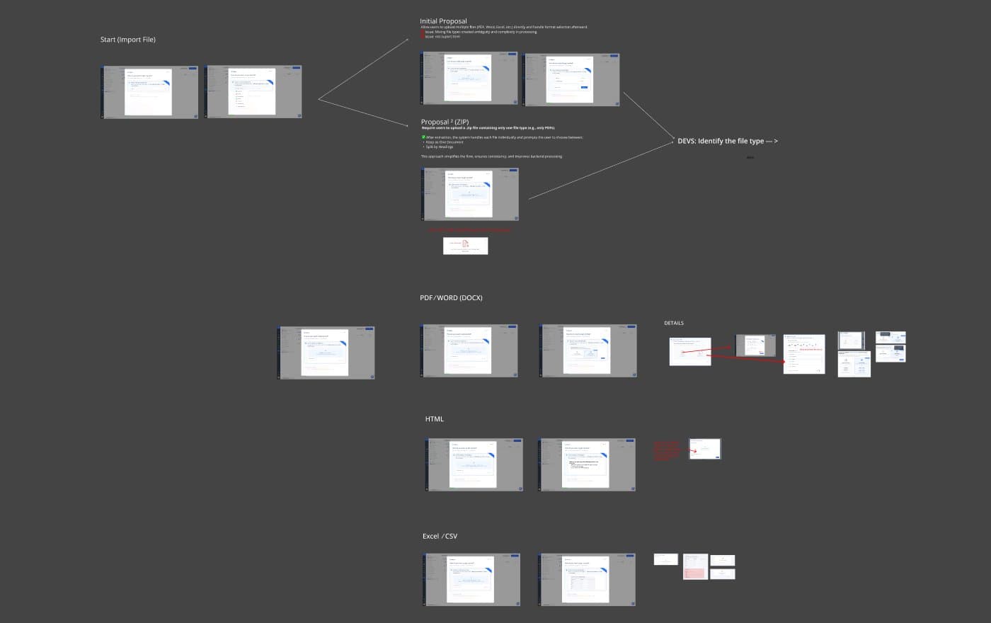
The ideation went deep into imports, because that is where it breaks. A link the product recognizes, one it does not, one file, many files, a zip, PDF, Word, HTML, spreadsheets. I worked through each case with engineering before designing the happy path.
The new onboarding starts with a promise the product keeps: create a knowledge base in 10 seconds. Then four steps. Paste the link to the old knowledge base and it imports, or upload files. Choose who can access it. Pick a layout with a live preview. Last, the knowledge base arrives already styled with the customer's logo and colors, ready to tweak or launch.
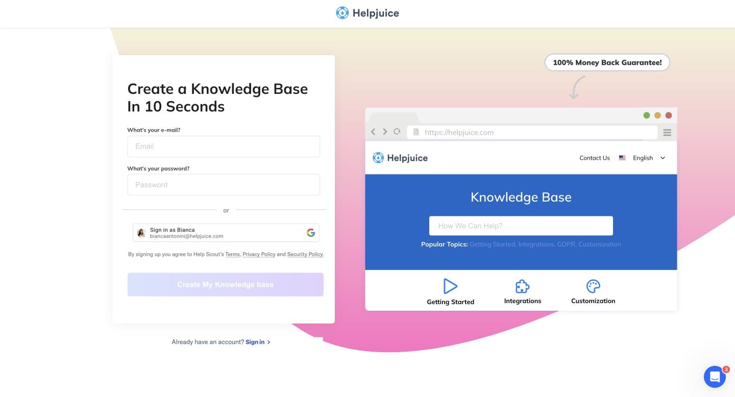
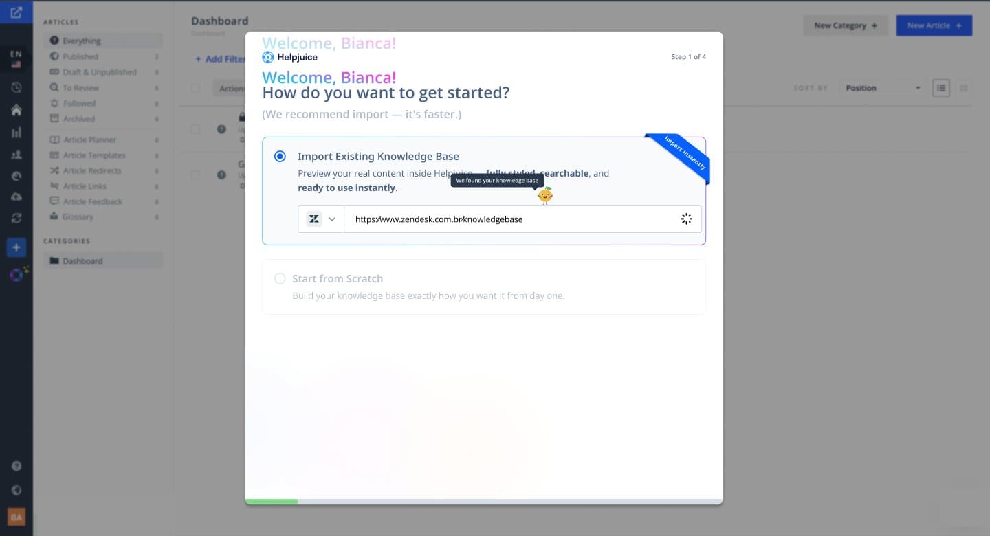 1 · Import
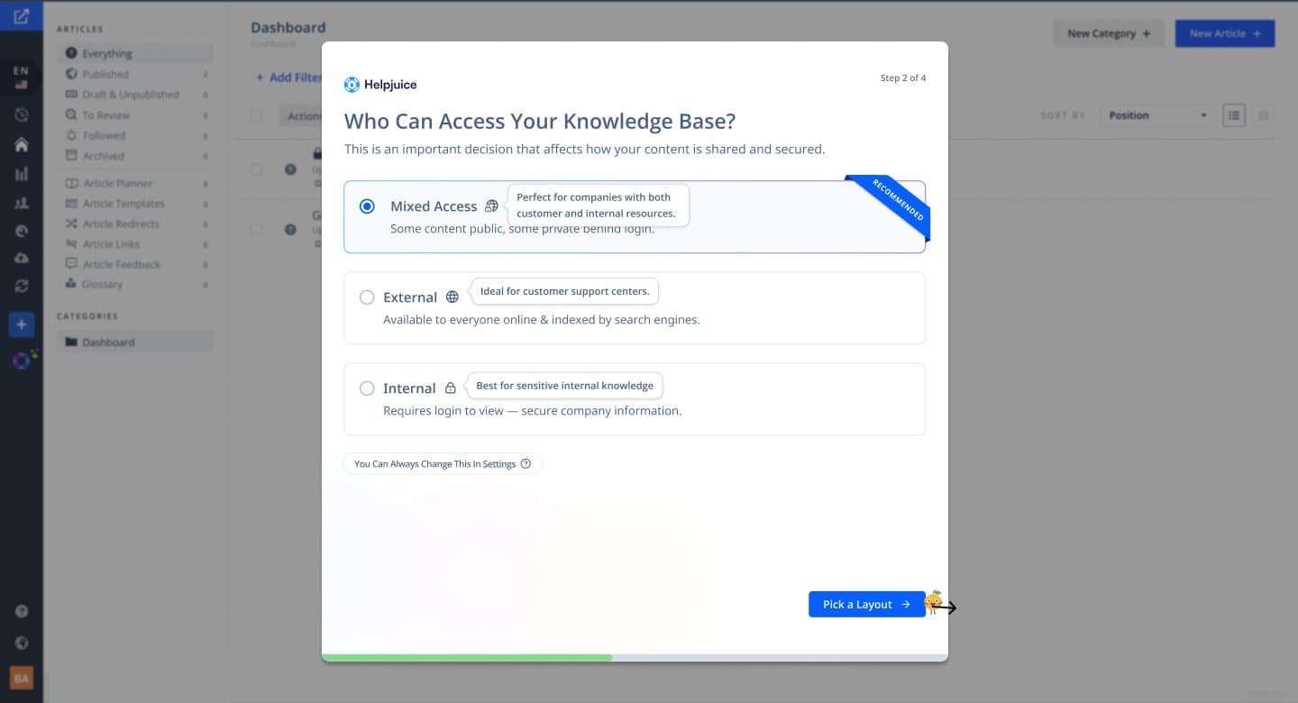 2 · Access
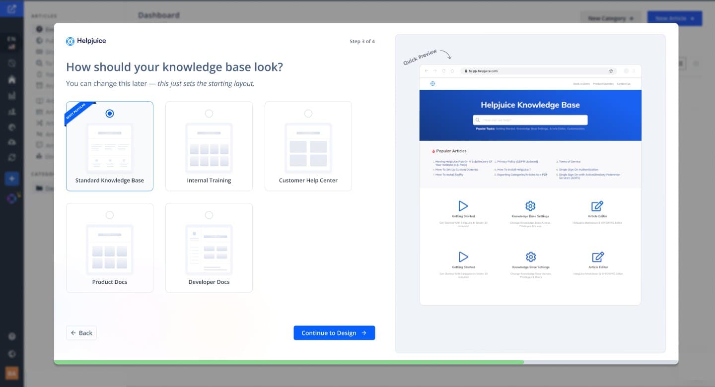 3 · Layout
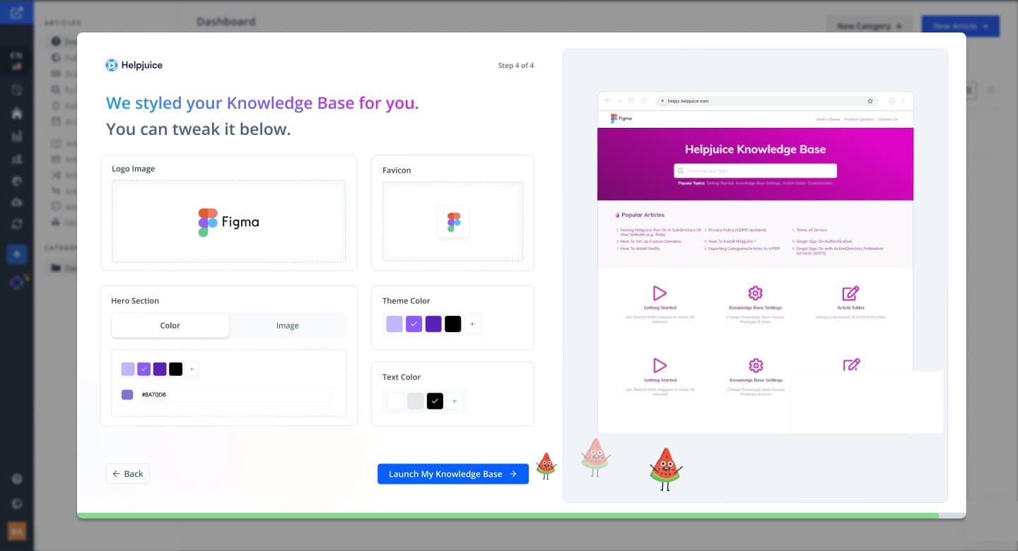 4 · Brand
- retention after onboarding, measured by leadership after launch, with no sales contact
- 7% → 37%
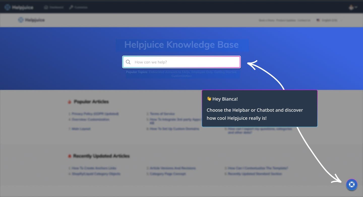
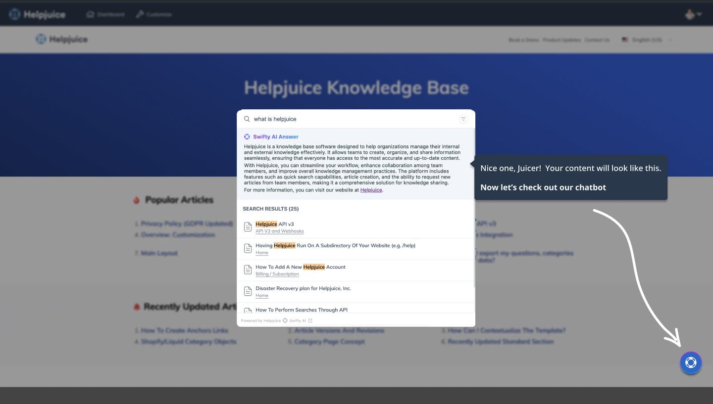
Right after, a short interactive demo runs on the customer's own content: try the AI helpbar or the chatbot first, then a guided tour to the dashboard. A free consulting session is offered along the way, and skipping it is one click.
Shipped · Article requests
Keeping the knowledge base current without a knowledge manager
Every successful customer had someone dedicated to keeping the knowledge base current. Most customers did not, and their content went stale. The goal was a knowledge base that stays up to date without a knowledge manager.
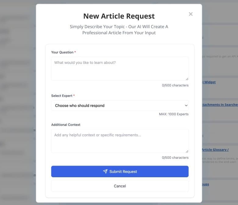
The knowledge already existed, in people. The hard part was getting it out of their heads without asking them to become writers. I designed it in three steps: ask the team, the expert shares what they know in any format, and AI writes the article.
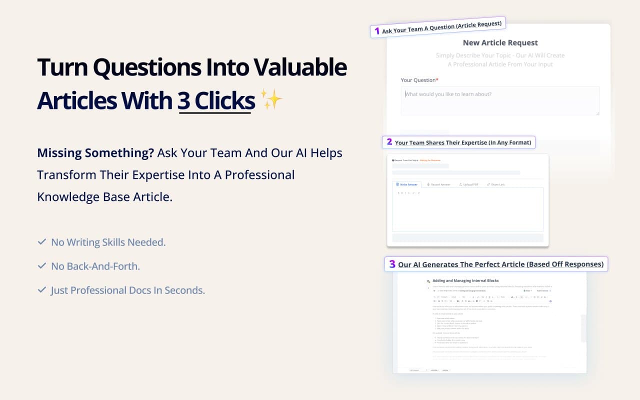
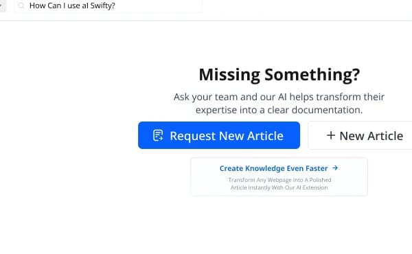
A request can start anywhere a gap shows up: from the article planner, from the Chrome extension, or from a search that finds nothing, where the request is offered on the spot. AI also scans the content and opens requests on its own when something is missing.
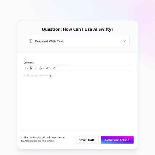
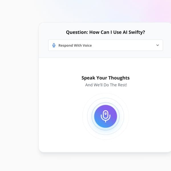
The expert gets an email with an Answer now button that opens the question directly, with no login. They answer however is easiest for them: typing, talking, or pasting a YouTube, Loom or WizardShot link. AI turns any of it into a structured article.
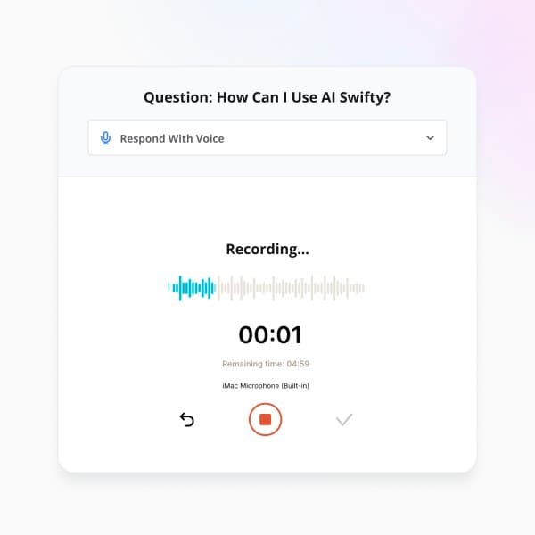
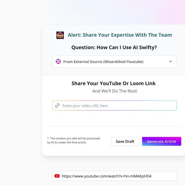
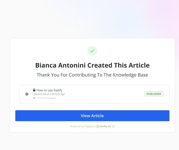
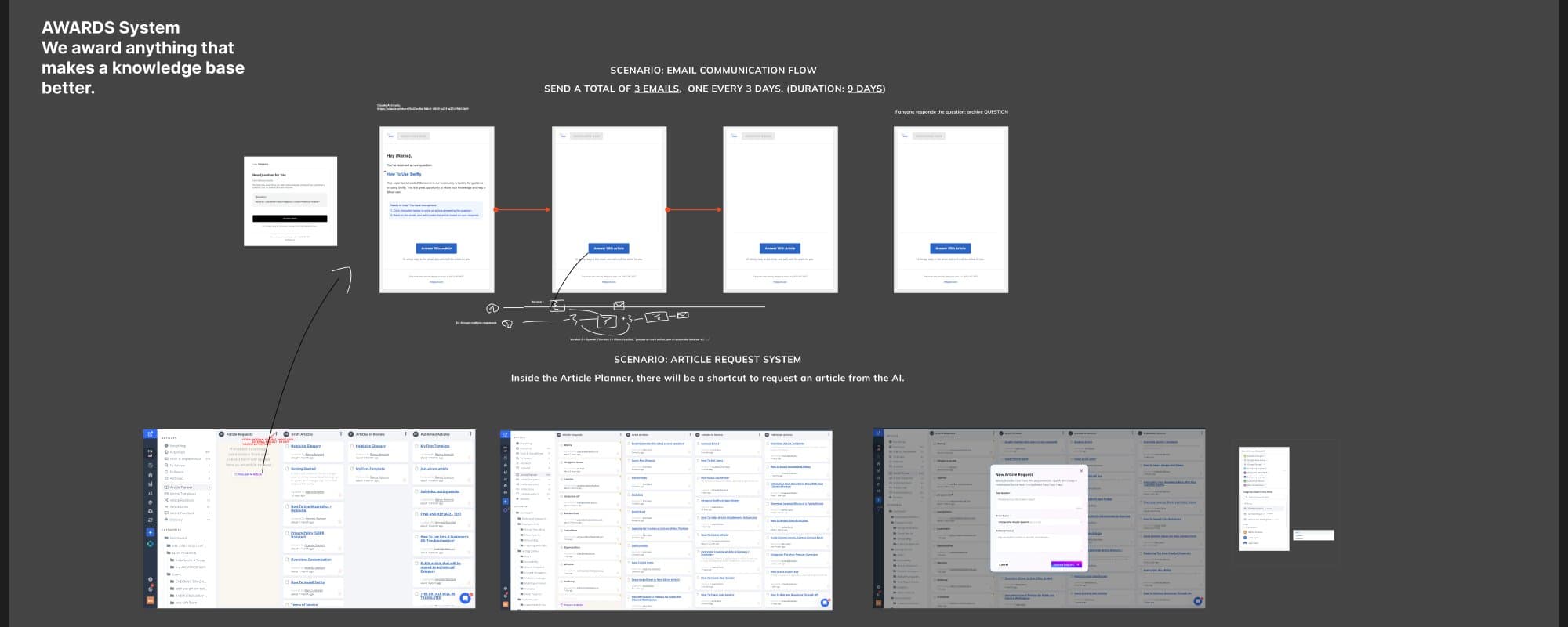
If nobody answers, a reminder goes out every three days, three times. When the article is ready, the person who answered gets the credit, and the request moves across the planner on its own, from request to draft, review and published.
Shipped · Swifty: AI chatbot and AI search
Putting the knowledge base wherever customers already are
I conceived and designed AI Search and the AI Chatbot, and contributed to Swifty, the AI agent sales used as a differentiator. Swifty takes the knowledge base to wherever customers already are: a chatbot that answers from it, and a search bar that can also ask AI.
Before, the in-app widget was set up in one form: two color pickers, a position dropdown and a rules box, next to a static list of suggested articles. Nothing in it said AI, and nothing showed what the user would actually see.
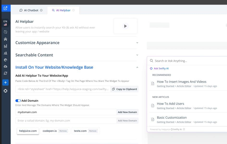
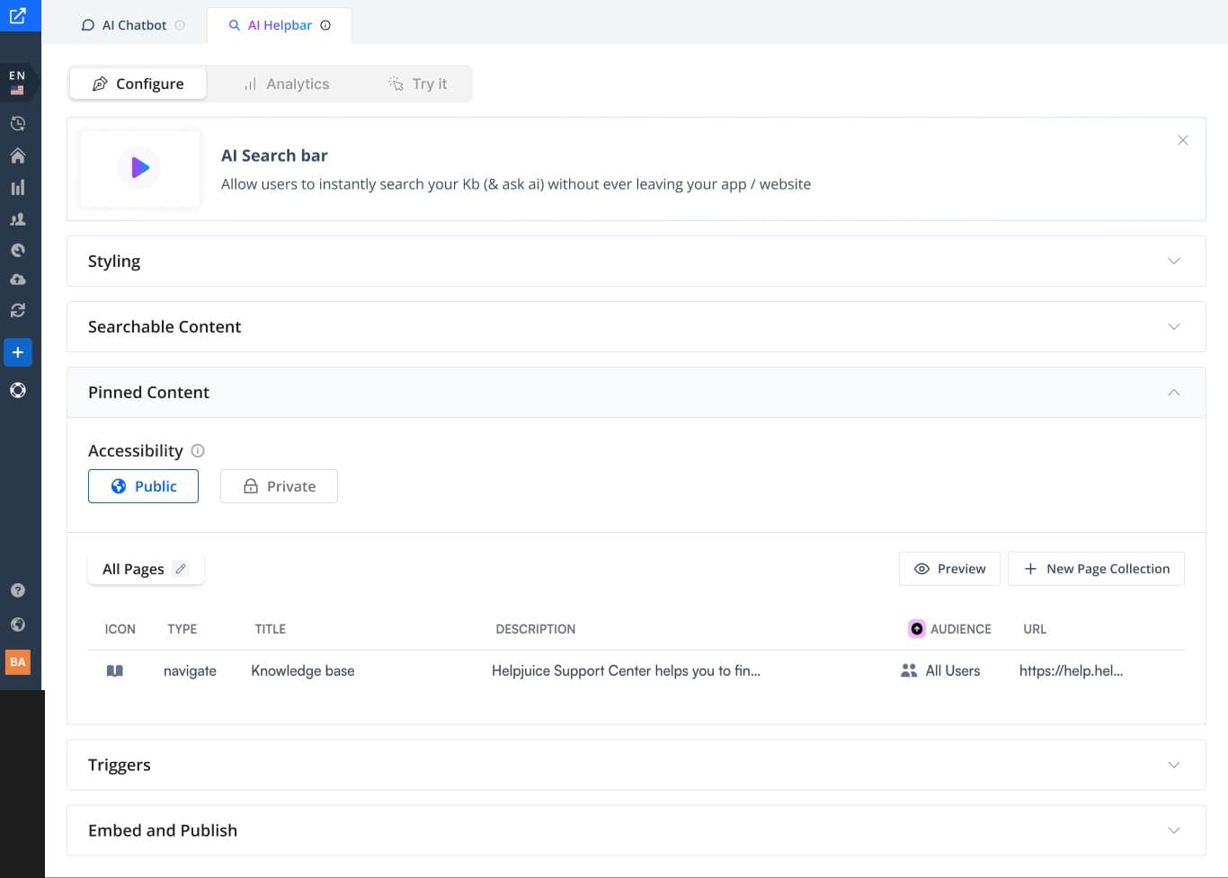
I redesigned the setup so admins never configure blind. Chatbot and search live in two tabs, every setting sits next to a live preview of the widget, and the same pattern runs through styling, searchable content, pinned content, triggers and install.
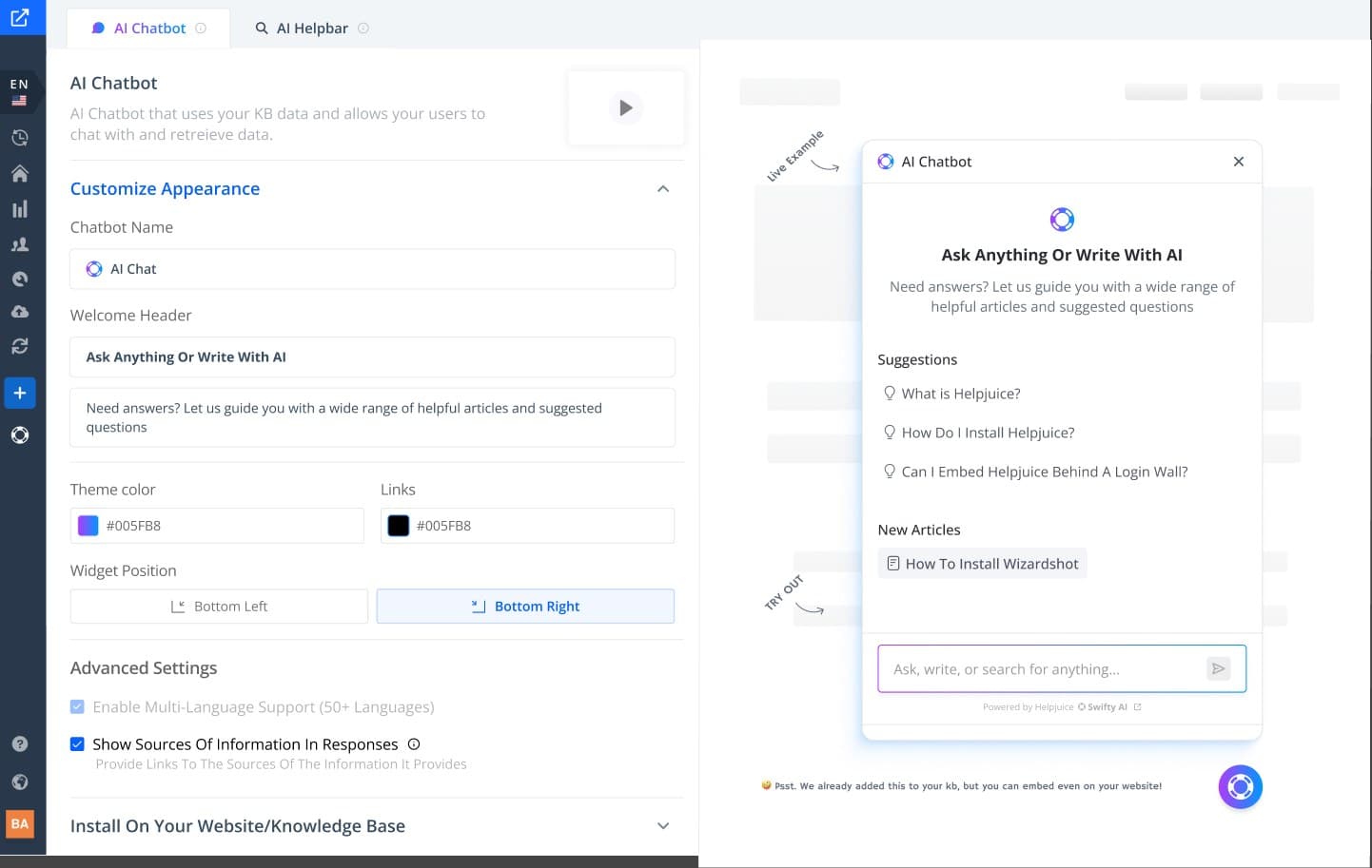
Trust was the other half. Answers link back to the articles they came from, the chatbot speaks more than 50 languages, and private content only shows up for people allowed to see it. Install lives on one screen: the code to paste, the domains where the widget may appear, and a switch to add it to the knowledge base automatically.
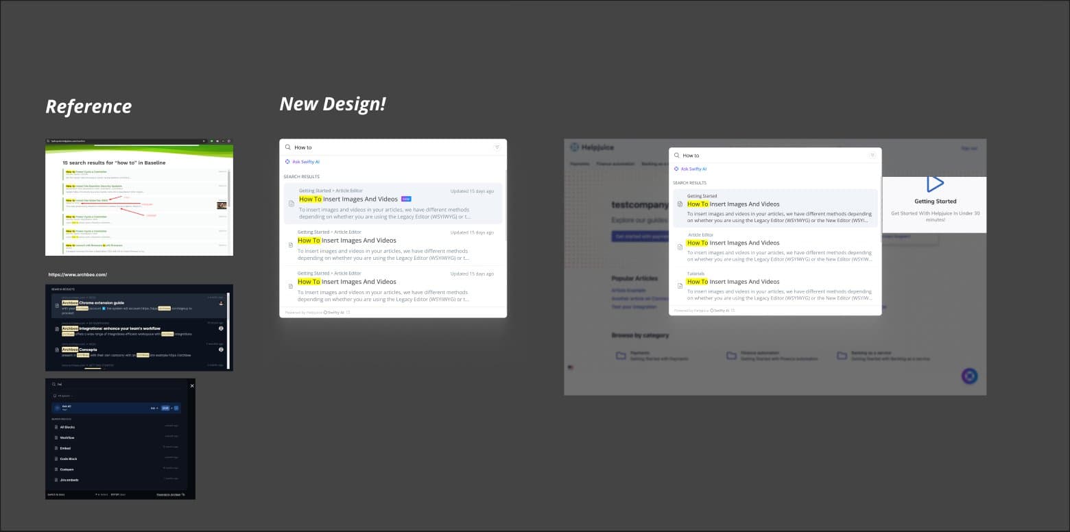
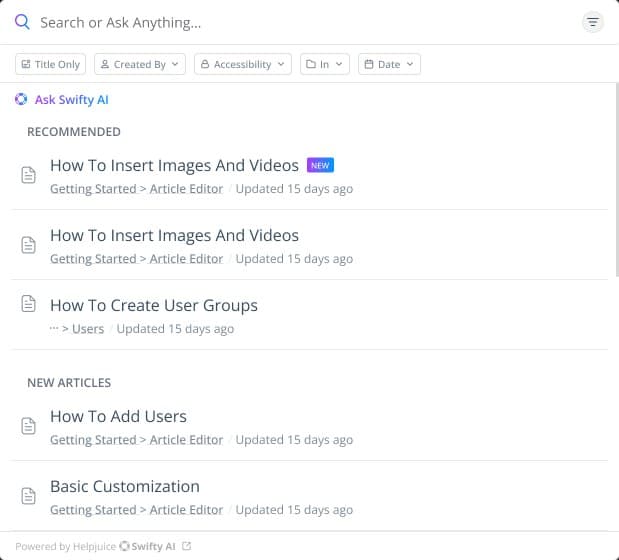
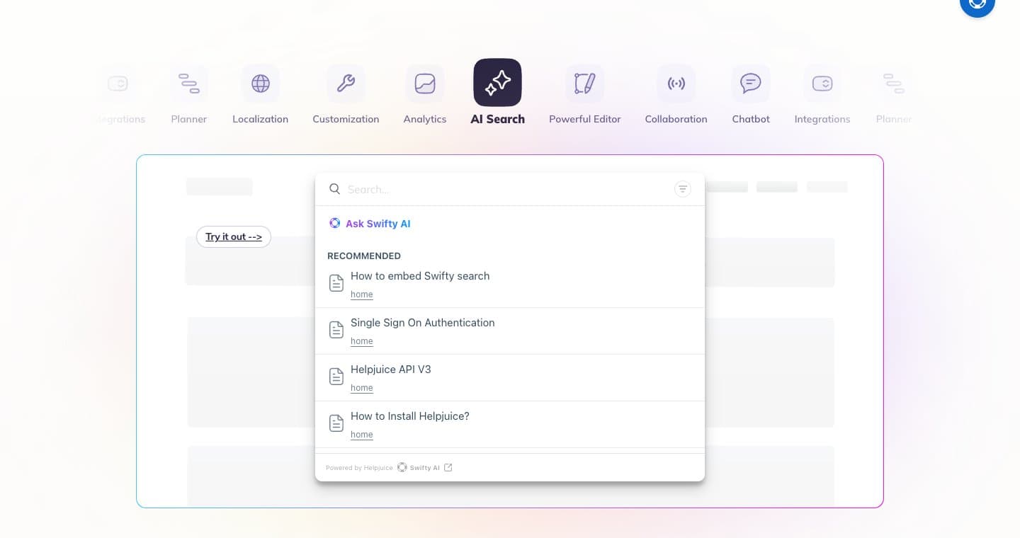
For search, I compared how other knowledge base tools show results, then redesigned ours: matches highlighted, the path to each article, when it was updated, and Ask Swifty AI always on top. Filters by author, access, category and date sit one row below the field.
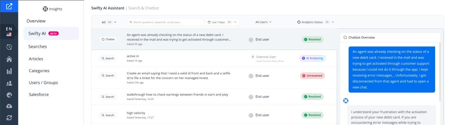
Admins then needed to see what people were asking. I designed AI Analytics together with one developer, and it went from idea to launch in a week: every chatbot and search question in one list, its status from resolved to unresolved, and the full conversation on the side.
Shipped · Helpjuice extension
Bringing the knowledge base into any tab, two slashes away
People were losing time switching tabs to find an answer they had already written. The idea was to bring the knowledge base to wherever they work.
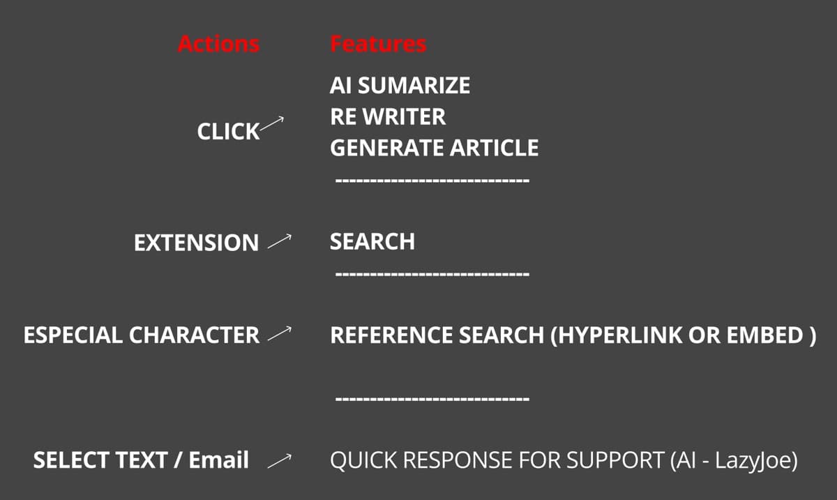
I started with drafts and discussions with the team. The first map gave each feature its own way in: a click for AI summaries, rewrites and new articles, the extension icon for search, a special character for linking an article, and selected text for a quick reply to a support ticket.
Then I designed every user scenario: installing and logging in for the first time, a knowledge base with no articles yet, searching, creating an article with AI, and requesting one when nothing matches. None of them ends in a dead end. An empty search turns into a request to the right expert.
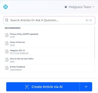 Search
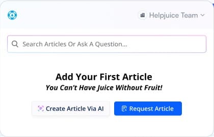 No articles yet
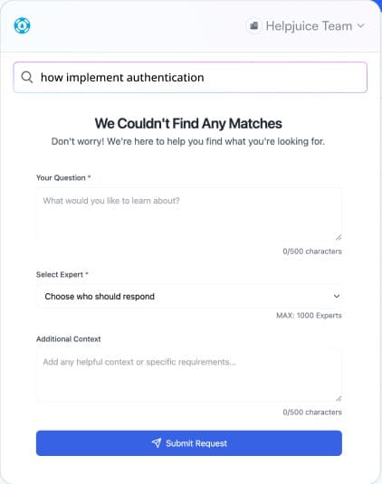 No match
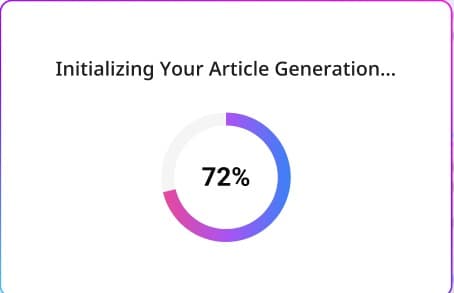 Generating
The core move shipped as two slashes: type them in any text field, like an email or a chat, and insert an article without leaving the page. I also designed the images for the Chrome Web Store.
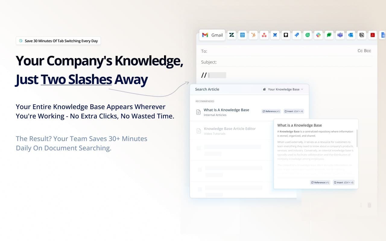
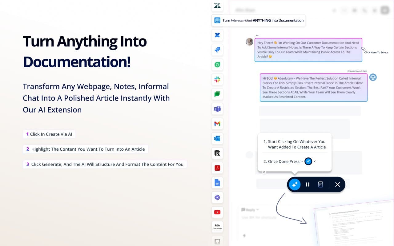
It works the other way too. Highlight any webpage, note or chat, and the extension turns it into a structured article. Requesting a missing article is one click away.
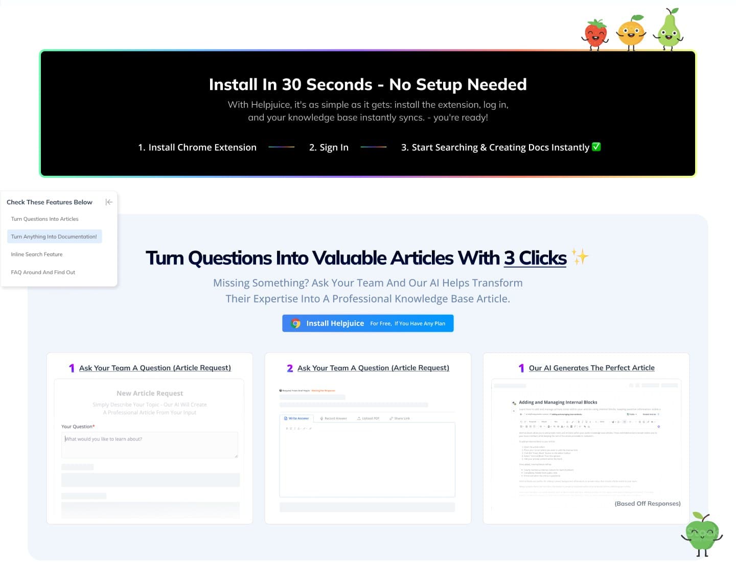
The landing page sells it in the order people use it: install in 30 seconds, sign in, then search and create from anywhere.
Shipped · WizardShot extension
A new product, from a blank file to a Product Hunt launch
I designed WizardShot from scratch: it records a process on screen and turns it into a step-by-step tutorial with AI. It launched on Product Hunt in May 2024, with me listed as one of its makers, and reached #2 Product of the Day.
Capturing starts with one click in the extension. Every click becomes a step, with the screenshot and a marker on where to click, and the finished tutorial can be embedded, shared or turned into a Helpjuice article.
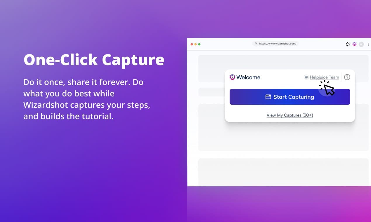
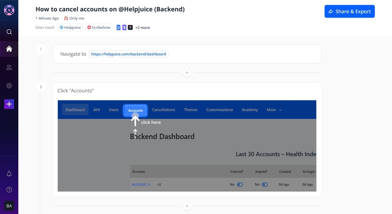
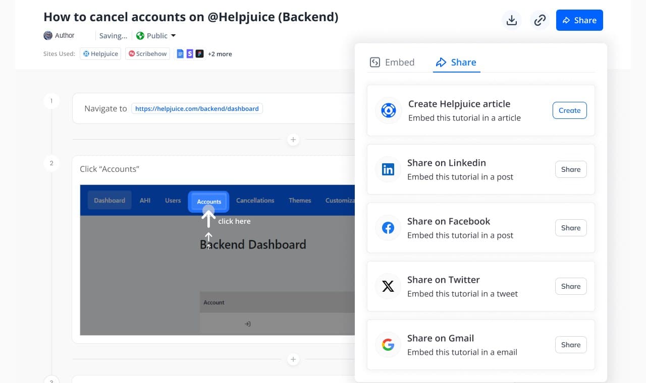
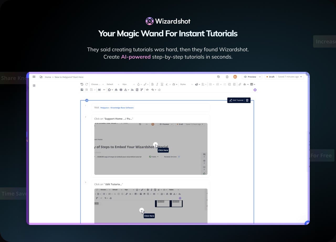
"Today I planned 3 hours for creating tutorials but with WizardShot it has taken me 15 minutes!" A user review on Product Hunt.
Shipped · Website
Selling an outcome instead of software
The old site sold software. I redesigned the whole website, from home and pricing to the examples and about pages, so it sells an outcome instead: a knowledge base that actually gets used. Signup conversion improved.
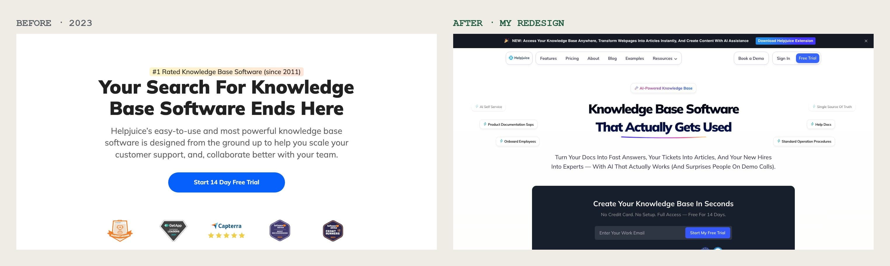
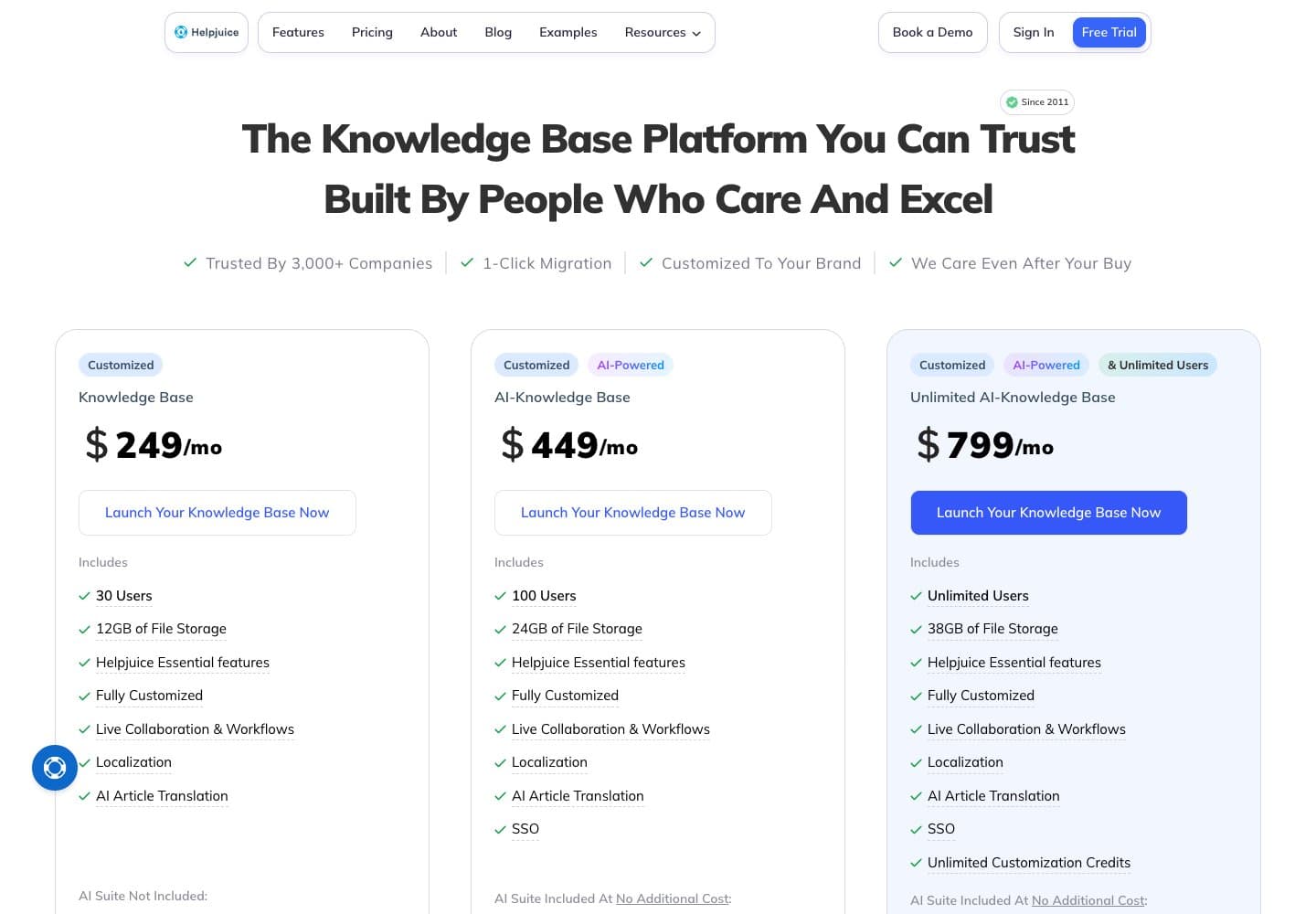
Instead of a wall of feature names, the homepage lets visitors click through each feature and see it working, starting with AI search. Pricing shows what every plan includes, with the AI suite as the difference between tiers.
I thought through every page, not only the home. The examples page went from a long gallery of screenshots to a library people can filter by use case, where each theme says what it is for and links straight to building one.
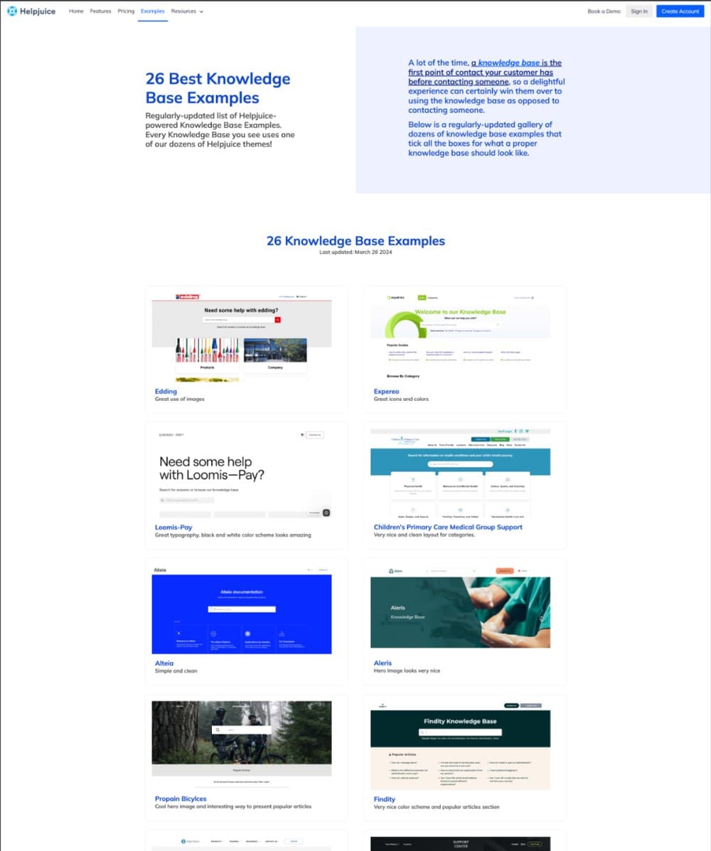 Before
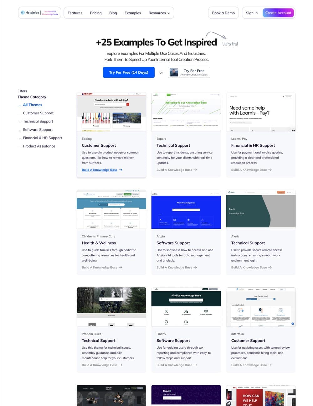 After
AfterFoundation · Design system and process
Building the foundation so a small team could ship all of this
When I joined there was no design system, no process and no standards. I built all three from scratch and mentored a design intern. That foundation is what let a small team ship this many features without the product falling apart.
- support tickets after fixing core UX flows
- -87%
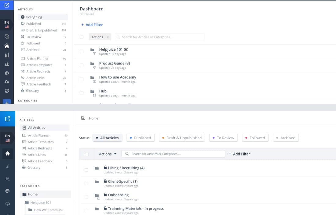
Reviews said the product looked outdated, even when people liked the features. With the system in place, I planned a refresh of the older pages: dashboard, article planner, templates, redirects, links, feedback and glossary. Each one had to match the visual language of the newer features, with consistent modals, pop-ups and error messages.
I wrote the refresh as starter tasks for the new design associates. Each page was a small, one or two day job, so they could learn the system by shipping real work from their first week.

More
Also designed
Customers had a lot of criticism of the knowledge base themes, so a small group was invited to a co-creation session. They pitched ideas and I designed live in Figma while they were still in the room. Around the themes I designed how customers make them their own: a visual editor with code one tab away, the admin bar inside the knowledge base, and the link previews.
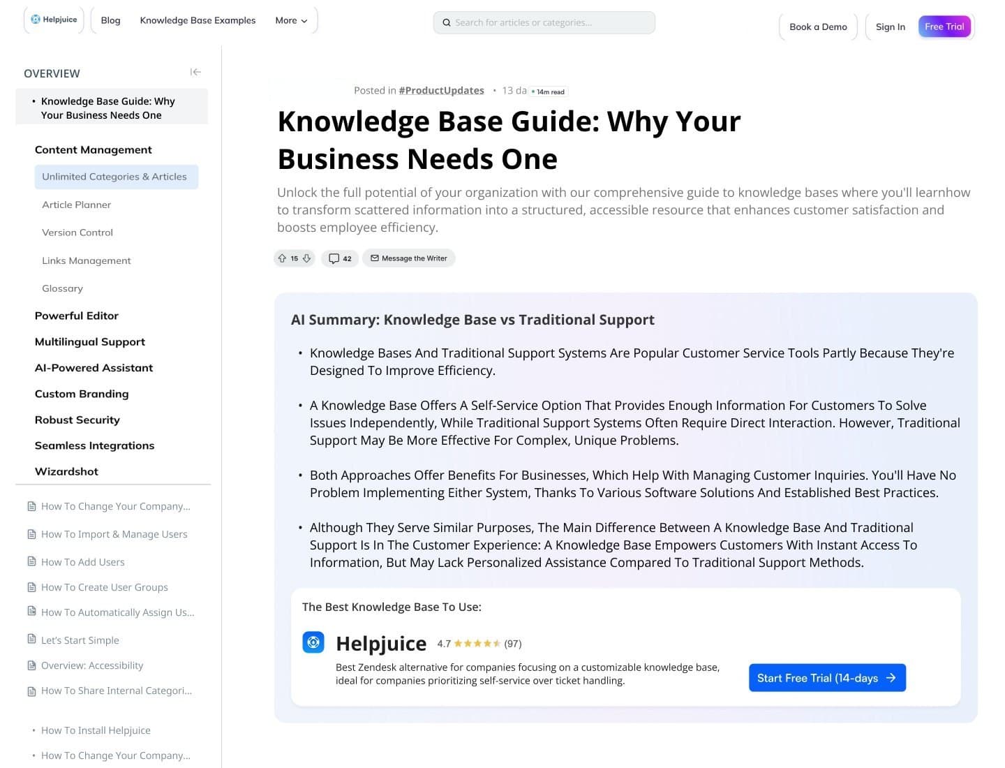 Article themeCo-created with customers, with an AI summary on top.
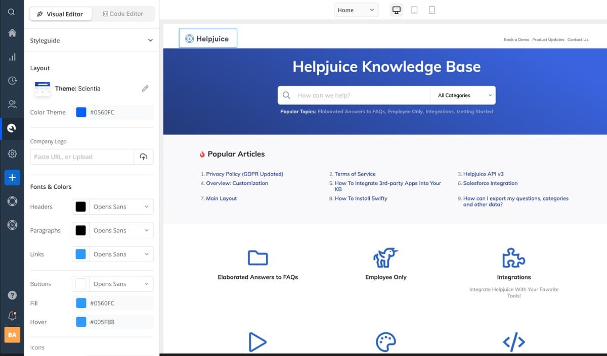 CustomizationA visual editor next to a live preview, code one tab away.
 Theme pickerSwitching themes in the same screen.
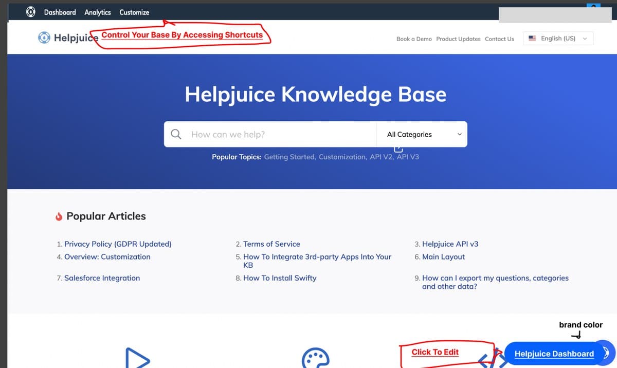 Admin barShortcuts inside the knowledge base, by role.
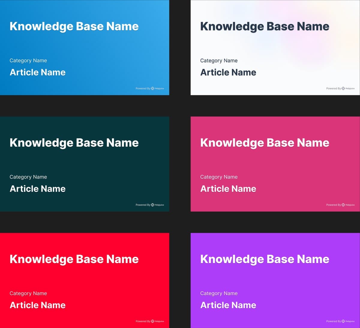 Link previewsOne template in any brand color.
Inside the article editor I designed Swifty Writer, an AI toolbar to write, dictate, generate, match a tone and improve. The idea came from the founder; I designed every state, and nothing touches the article until the writer inserts it.
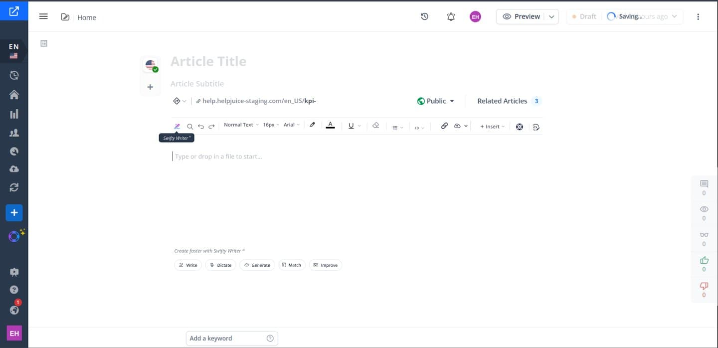 Swifty WriterFive ways to start an empty article.
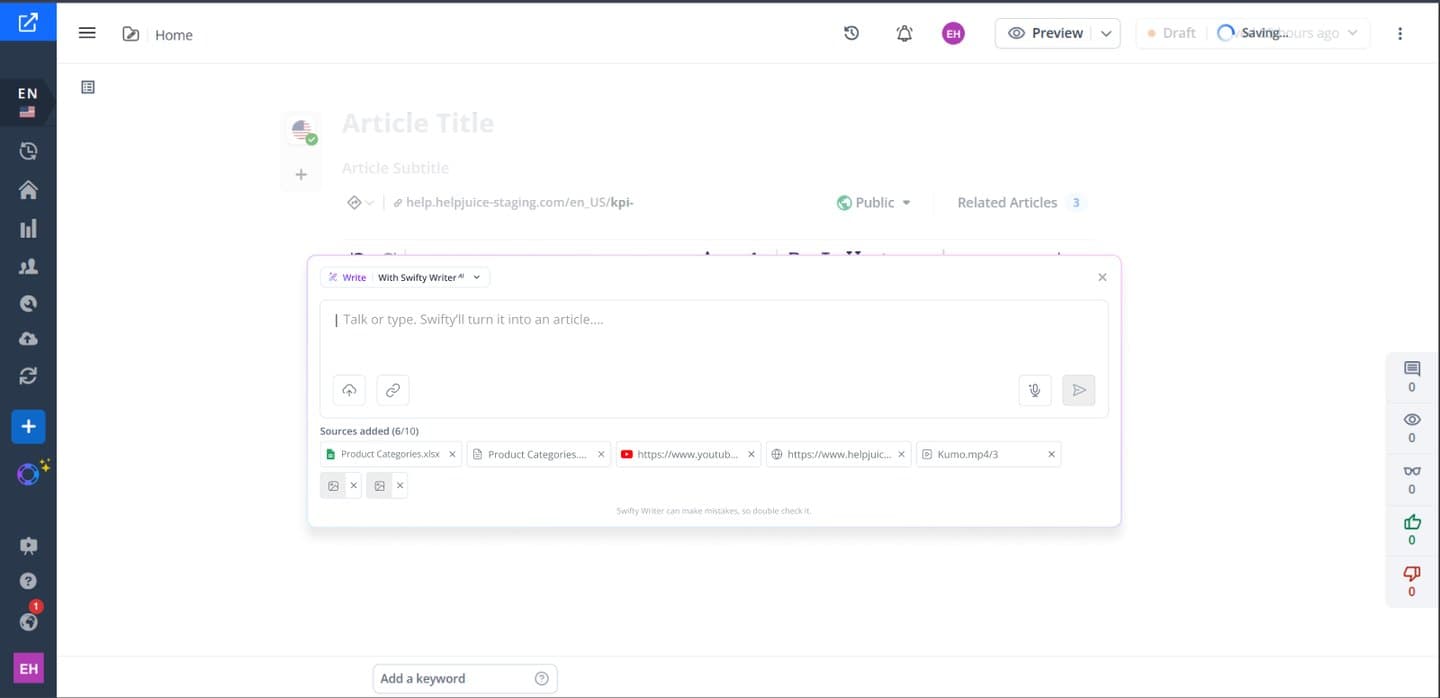 SourcesFiles, links and videos as chips before generating.
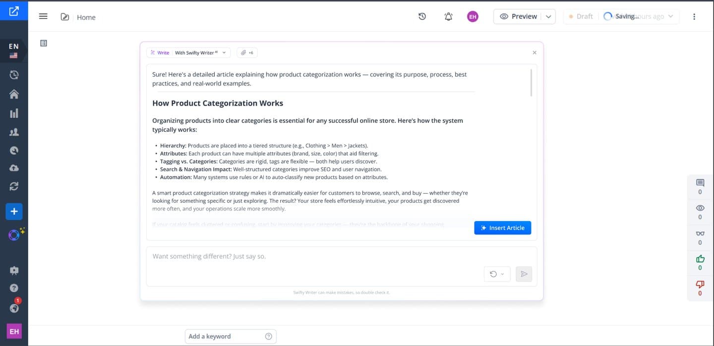 AnswerWaits in the panel until the writer inserts it.
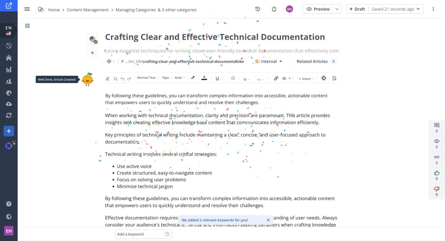 InsertedKeywords added and a small celebration.
Around the website I designed the about page and the product emails. For the AI launches I had a lot of creative freedom and started from a moodboard in Y2K, Memphis and NeoBrutalism.
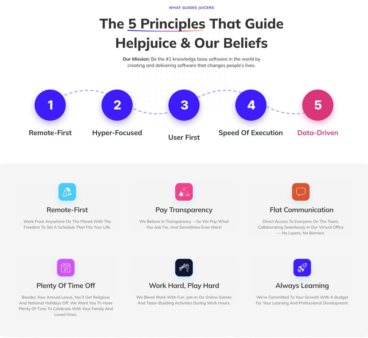 AboutThe culture as five principles.
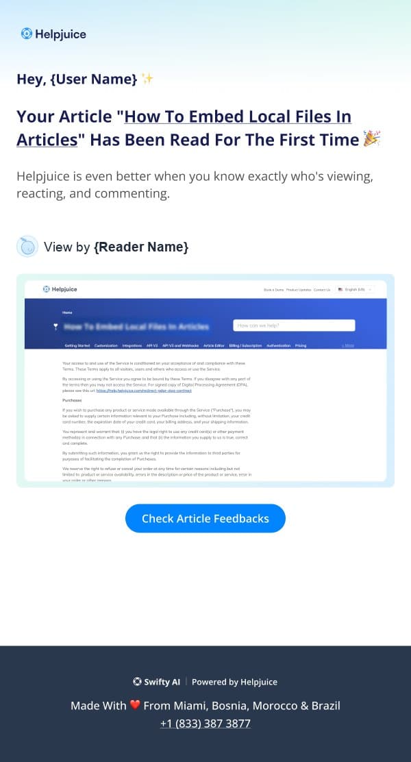 Product emailsRecreated, like the first read of an article.
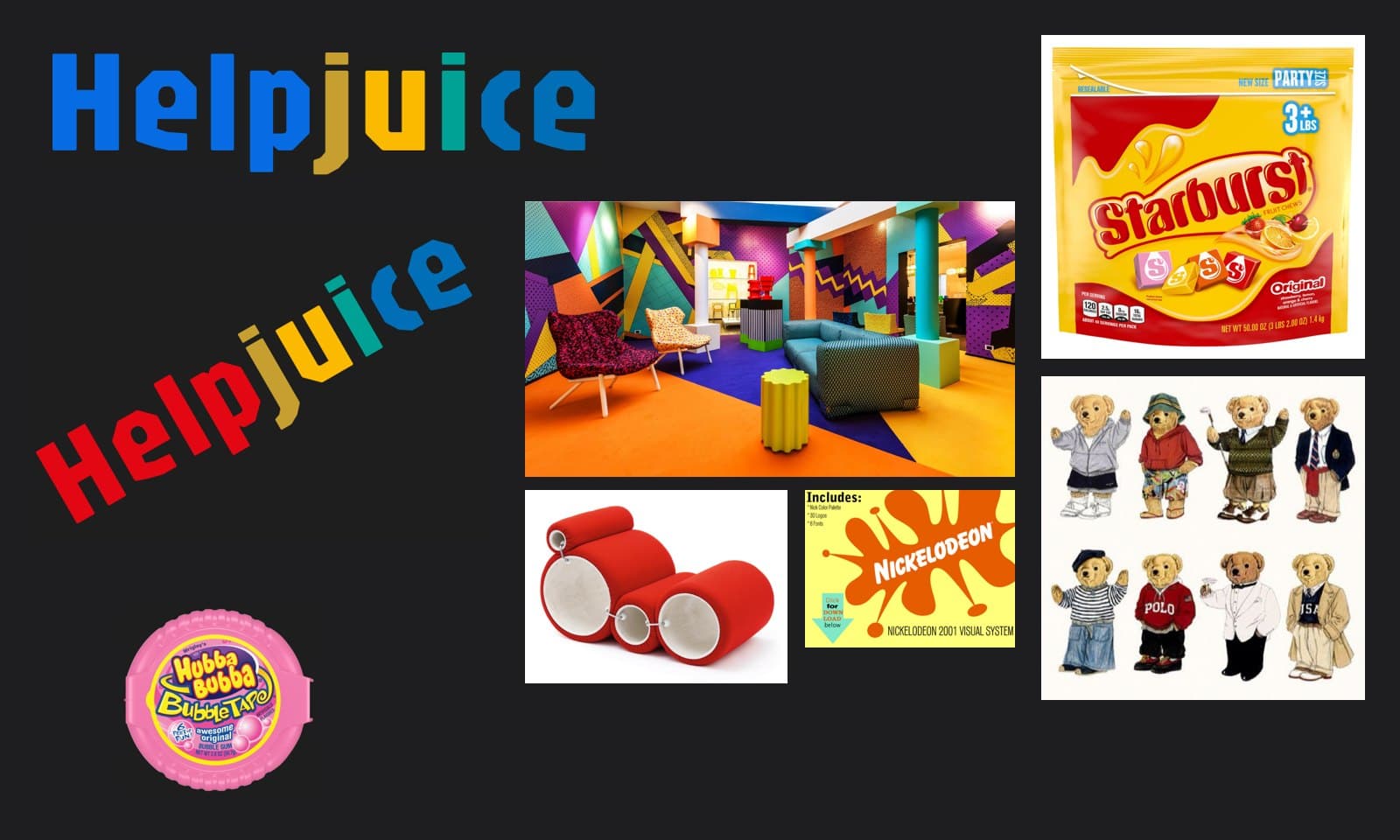 Launch moodboardMemorable, playful and vibrant.
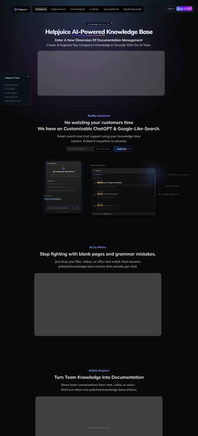 AI launch pageBuilt around a live demo.
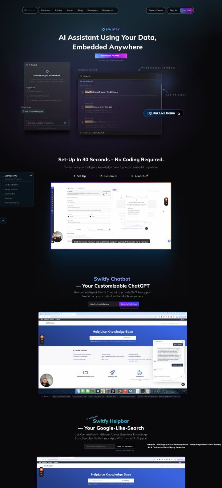 Swifty launch pageSet up with no code, shown working.
Learnings
- Activation is a design problem: if value depends on a human doing setup for the customer, the product is not done.
- AI earns its place when it removes a step people dread, like migrating content or writing the first draft.
- A product that depends on people doing chores needs a reason to come back. Rewards and reminders are design work too.
- Building the design system early let a small team ship many features without the product falling apart.