Licitanet · Public procurement platform (Brazil)
Public procurement, designed for every role that touches it
Licitanet runs electronic public procurement in Brazil: government agencies buy, suppliers bid, all in real time. In 2023, through the Growmate studio, I redesigned the website, the sign up for both sides and the system auctioneers and suppliers use. In 2025 Licitanet hired me again to complete the system, including the module where agencies plan a year of purchases. Both are live.
01 · Discover · Discovery
Two sides of the same auction
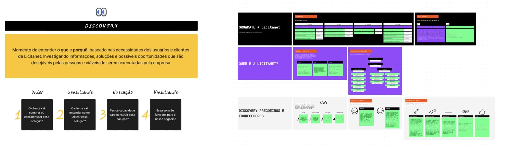
A public auction has two users who want opposite things: the auctioneer who runs it for the agency, and the supplier who wants to win it. I started by interviewing both, mapped their needs with an empathy map, and ranked ideas by value, usability, feasibility and viability before drawing anything.
02 · Join · Website and sign up
Putting the form where people clicked
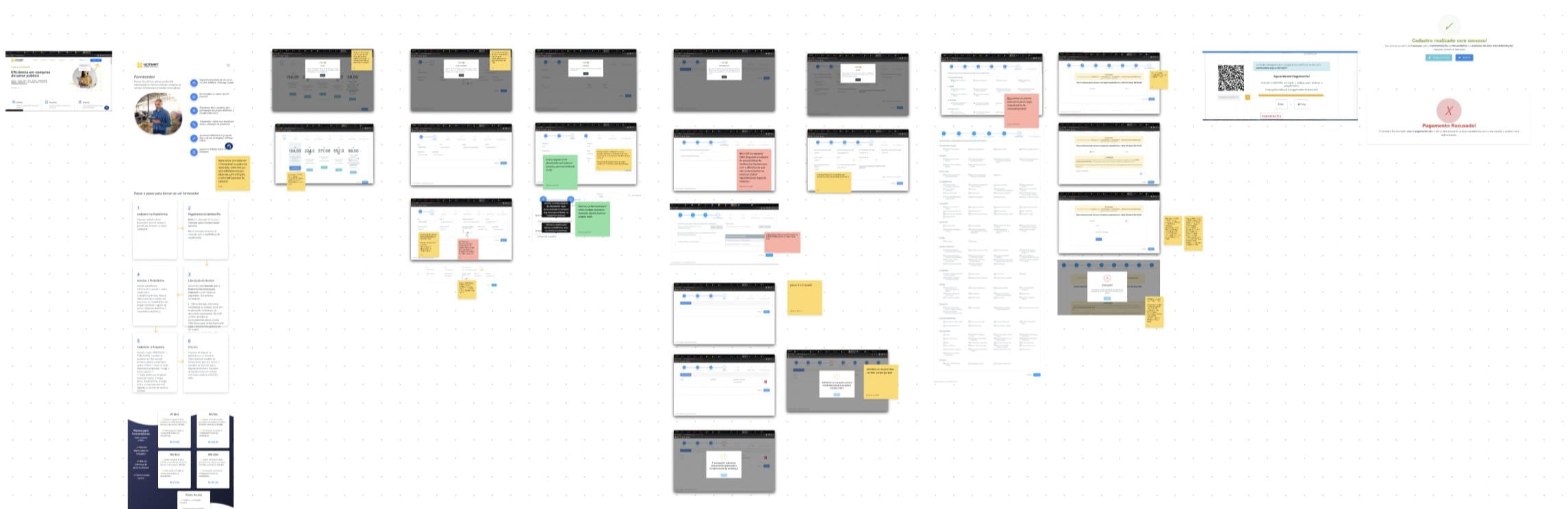
I ran a design critique of the whole journey, writing down what triggers each step and which information was essential or not. The worst moment was the sign up. A supplier clicked Sign up and landed on a long page, and still had to scroll to find the form. People should never have to search for something they already clicked.
I reworked the page so people reach the form without hunting for it, irrelevant information came out, and I rewrote the copy so a first-time supplier understands each step. Grid, color and spacing were reworked into components with variants, so the site could grow without drifting.
03 · Plan · 2025 · Annual plan
One plan, four roles, always clear whose turn it is
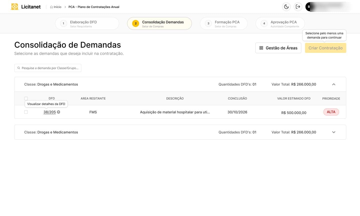
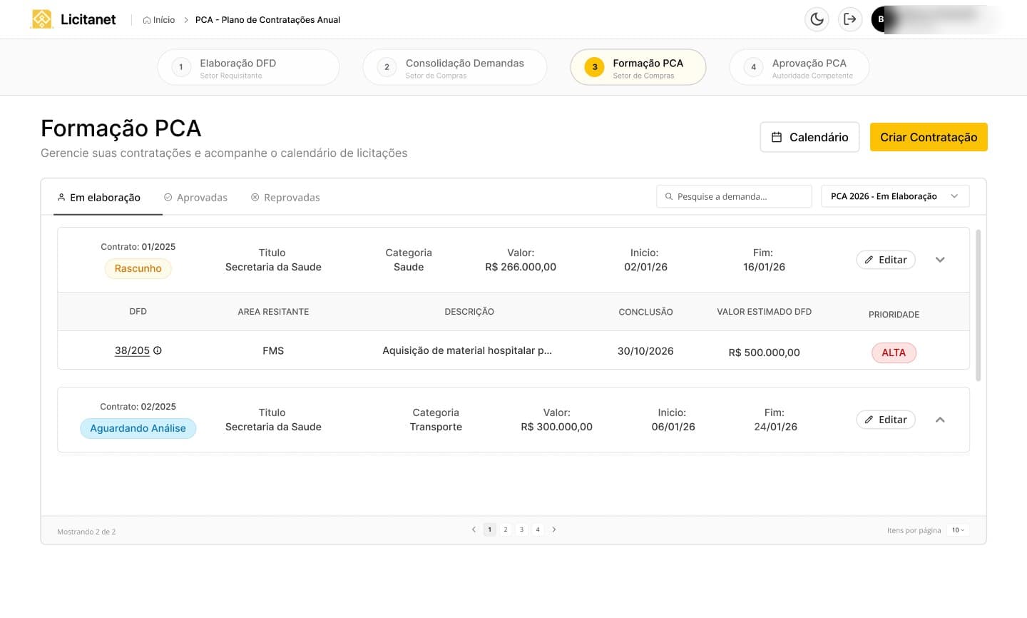
Every year, public agencies must publish an Annual Contracting Plan. It passes through four hands: the requesting department drafts each demand, purchasing consolidates the demands and forms the plan, and the competent authority approves it.
I designed the module around that relay. The same four step bar sits on top of every screen, with the role that owns each step written under it, so anyone opening the plan knows where it is and whose turn it is. Consolidation groups demands by category with their totals and priority, so purchasing sees the whole picture before creating a contract.
04 · Approve · 2025 · Return with a reason
A return always says why
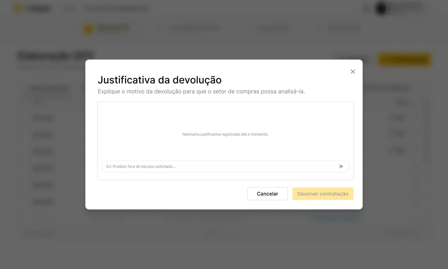
When the authority sends a contract back, purchasing needs to know what to fix, or the plan stalls in a loop. Returning requires a written reason, and the confirm button stays off until there is one.
05 · Research · 2025 · Price research
Letting the buyer choose how to price each item
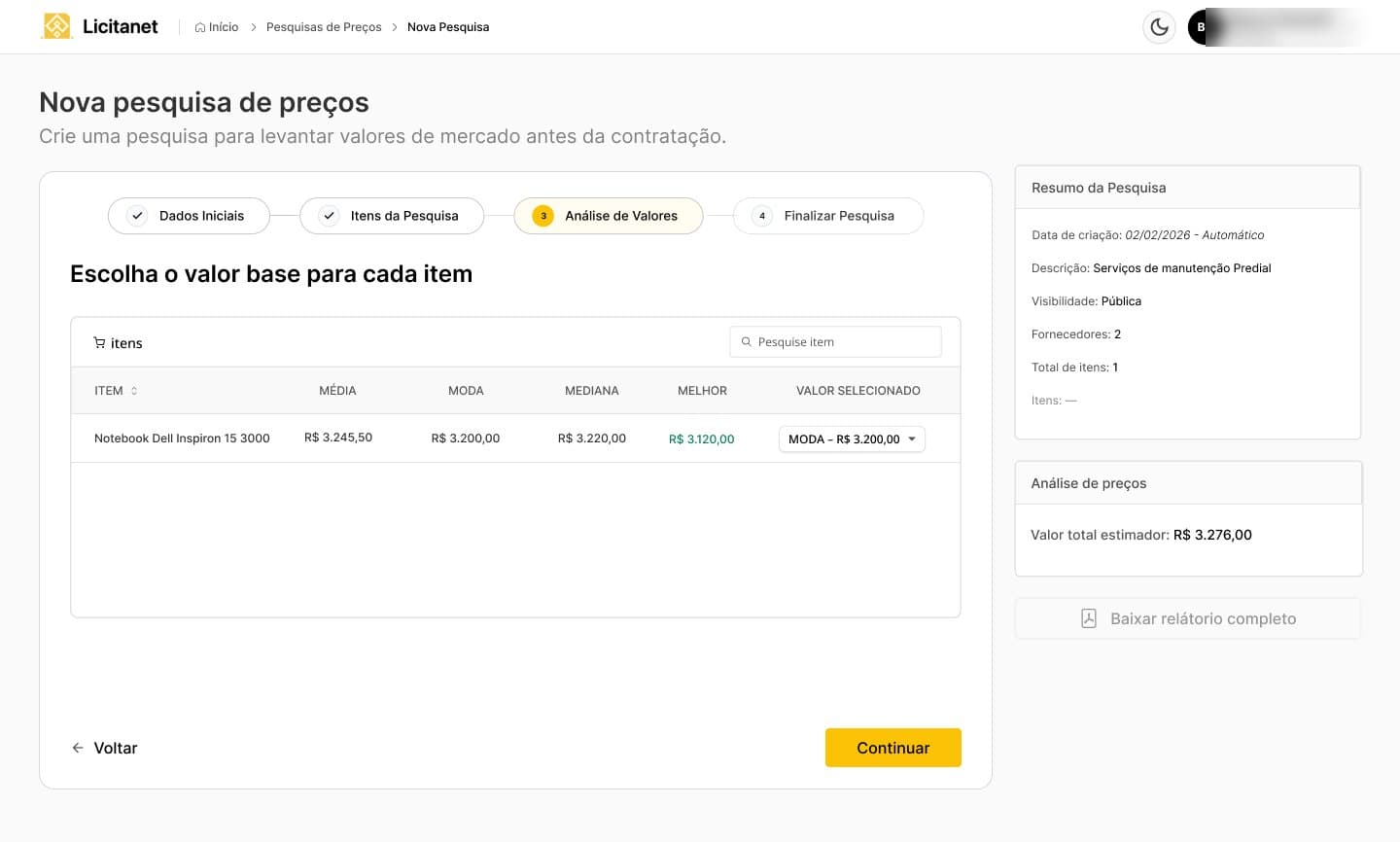
Before a contract, agencies research market prices. I designed it as four steps, initial data, items, value analysis and finish, with a summary of the research always visible on the side. In the analysis, each item shows the average, mode, median and best price found, and the buyer picks which one becomes the base value. The system does the math; the decision stays with the person accountable for it.
Learnings
- In public systems, the hardest design problem is the hand off between people, not any single screen.
- Never make people search for what they already clicked.
- Being hired again by the same client is the best feedback a designer can get.