Newcore, via Growmate · Real estate sales app (Brazil)
A sales app that tells real estate agents what to do next
Newcore recruits real estate agents and gives them an app to run their whole business: joining the network, listing properties, and working each client from the first call to the sale. The first version showed records, not work, and agents had to dig for what needed them. In 2023, at the Growmate studio, I was the only designer on a full redesign of the app, working session by session with Newcore's stakeholders.
01 · Discover · Journey mapping
Mapping the first version before drawing a new one
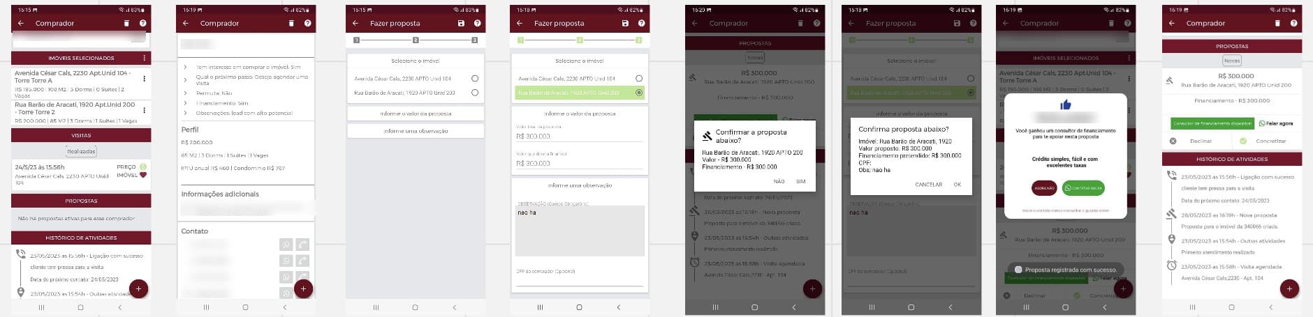
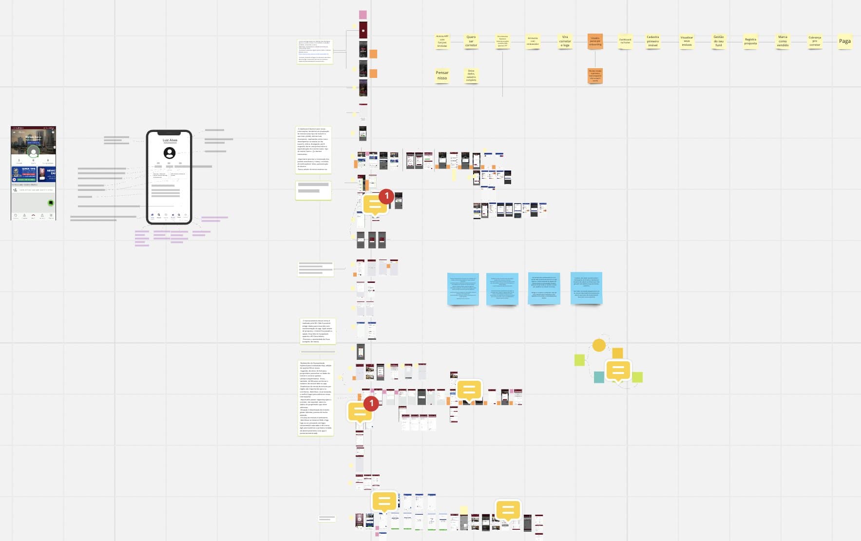
I started from the screens of the first version and mapped the whole journey, from someone who wants to become an agent to the commission being paid. Each step of that map was defined with Newcore's stakeholders in working sessions, before any new screen existed.
The map made the problem visible. The old app was organized around records, a buyer, a property, a proposal, each on its own screen. An agent opening it could not tell what needed attention today.
02 · Start · Home by scenario
Designing the home around who is opening it
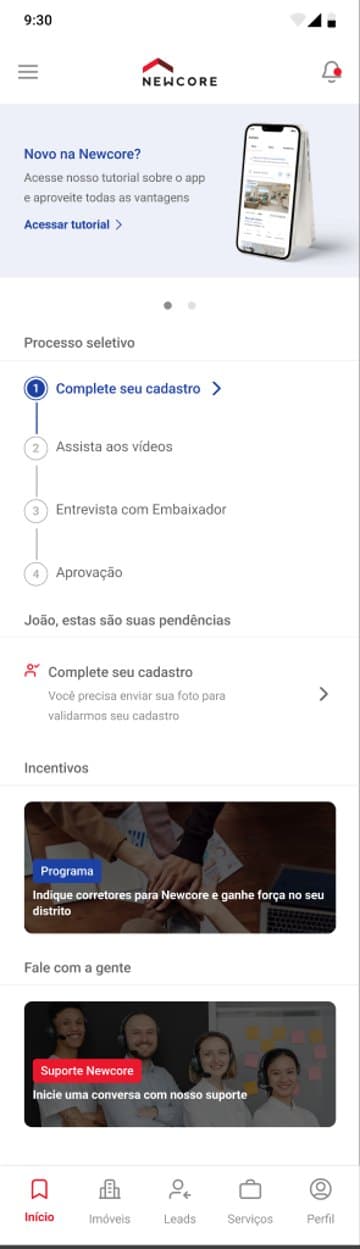
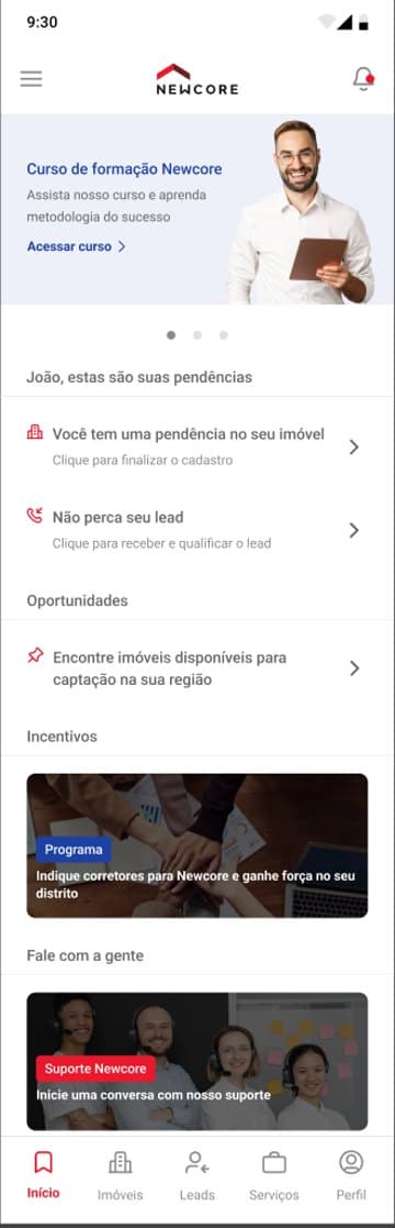
I designed every flow from a scenario, written on a card next to the screens: a candidate who signed up but has pending items, an agent with activity, a candidate who was not approved. First access and everyday use got separate homes, because they answer different questions.
A candidate sees where they are in the selection process and the one thing to do next. An approved agent sees their pending items first, a property to finish, a lead waiting for a call, then opportunities nearby.
03 · Sell · Leads
Everything about a client on one page
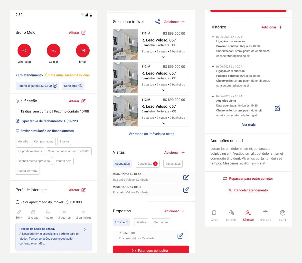
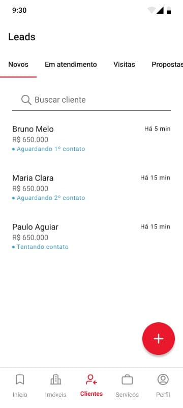
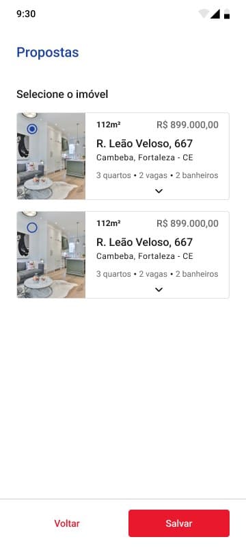
Leads are grouped by stage: new, in service, visits and proposals. Opening one brings everything about that client to a single page: how to reach them, how qualified they are, what they are looking for, the properties picked for them, visits, proposals, history and notes. From there the agent can also hand the client to another agent.
The stage moves by itself. I defined four stages, in service, visit, proposal and sale, and the system advances the client as things happen. In the first version, the agent cannot change it by hand.
04 · Deliver · Handoff
A file the client could review and developers could build from
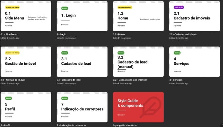
With this many flows, the file had to be easy to follow for two audiences. Every flow got a cover with its status, in review with the client, working or ready for development, so the stakeholders always knew what to look at. I added a changelog, a style guide with the components, and named layers so developers could find anything fast.
At the end, every flow had been redesigned in one consistent visual language.
Learnings
- An app for daily work should open on the work: what needs you today, not a list of records.
- Designing by scenario keeps every state honest. A screen that only works for the happy path is half designed.
- When stakeholders review in the file, the file is part of the product. Status and structure save meetings.